EMILY STROBEHN
Emily Strobehn is a graphic designer specializing in illustrative design and adores the use of vibrant color palettes to bring ideas to life. Driven by a lifelong passion for art, she approaches graphic design as "art with a purpose" and seeks to bridge the gap between aesthetic expression and goal-oriented execution. As a designer, Emily has always taken inspiration from the world around her, whether that be space, music, or movies, she longs to create designs and artwork to share with her community.
WINE LABELS
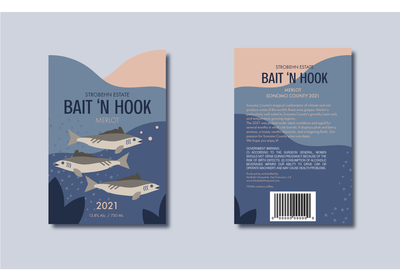
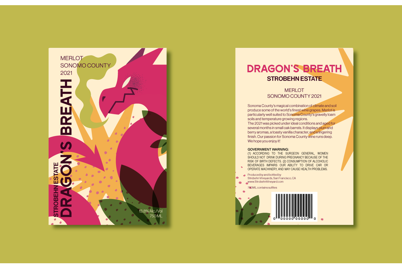
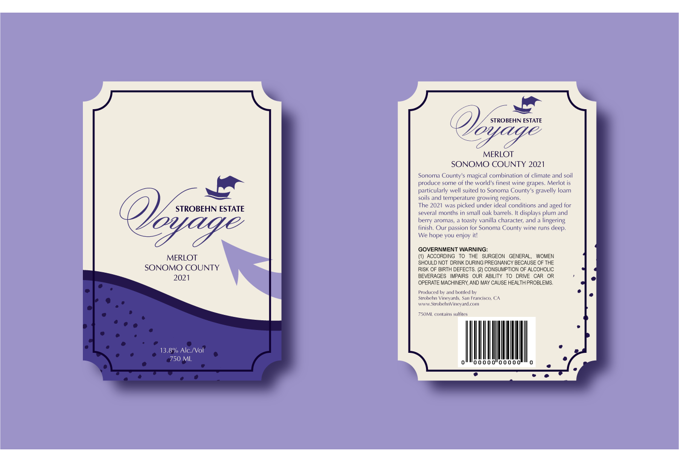
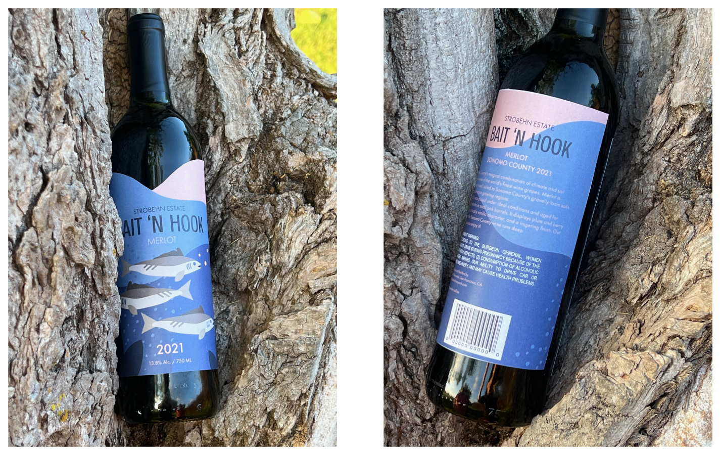
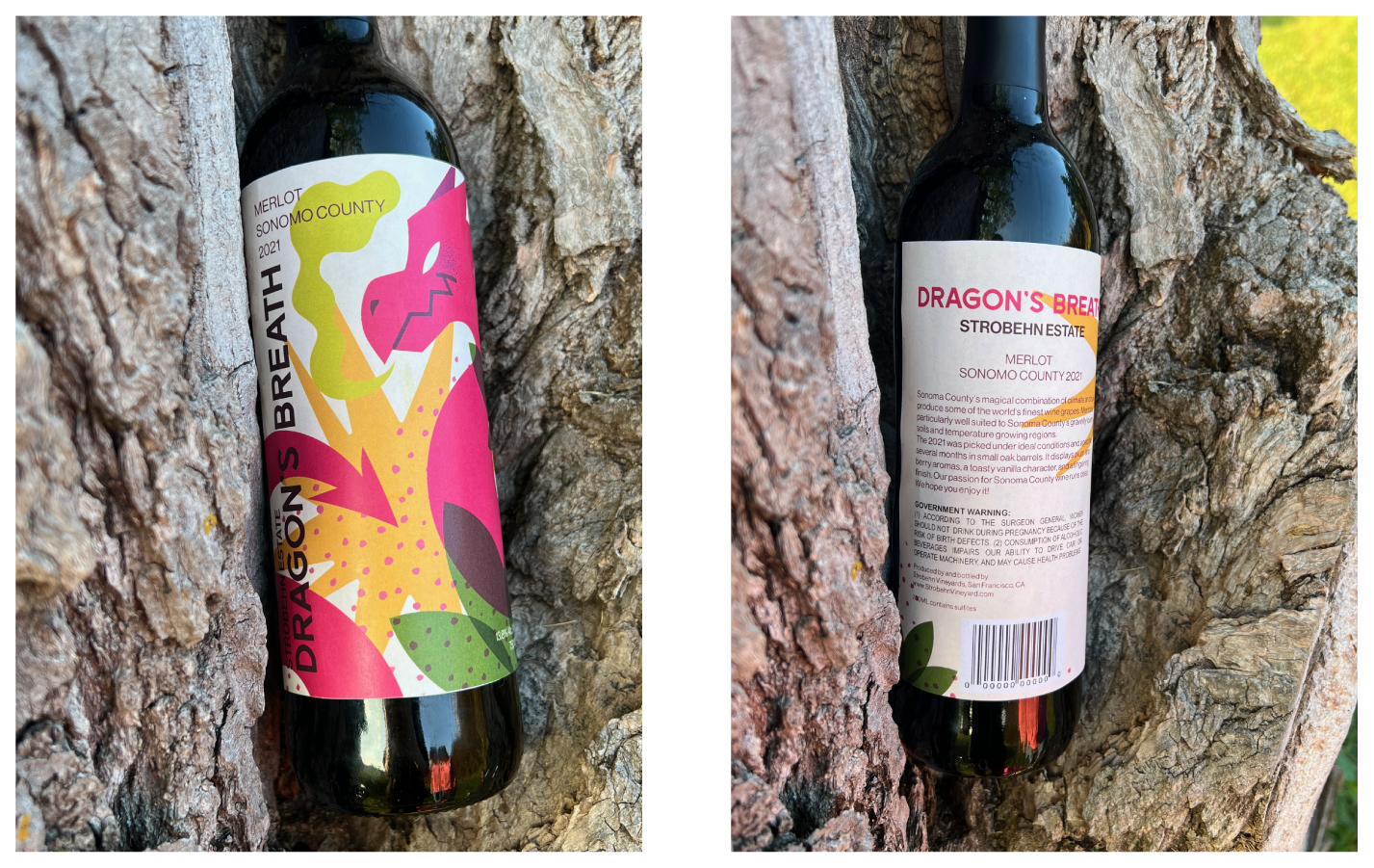
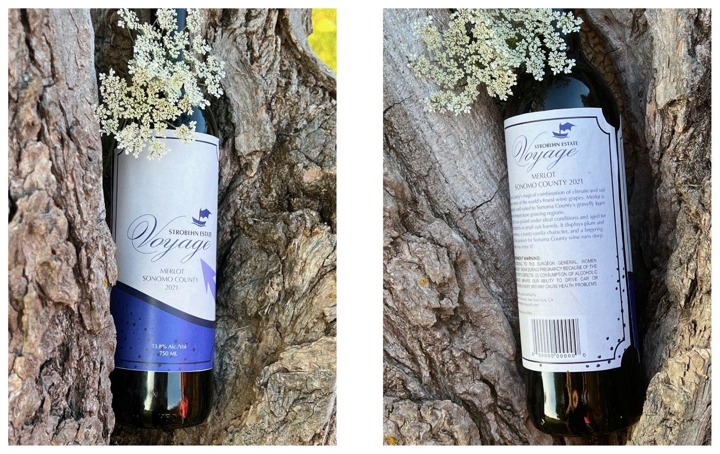
The objective of the project was to create three wine bottles under different demographics and prices. Starting at low range, to mid range, to high end! Each wine label had a different target audience and therefore a different design path that depended on each different type of audience.
The wines in order are based on the following demographic:
1. Casual, fun, sense of humor.
2. Contemporary, modern, leading edge.
3. Traditional, high quality, premium, expensive
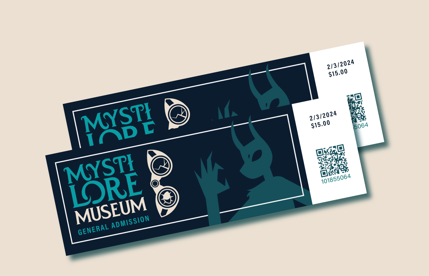
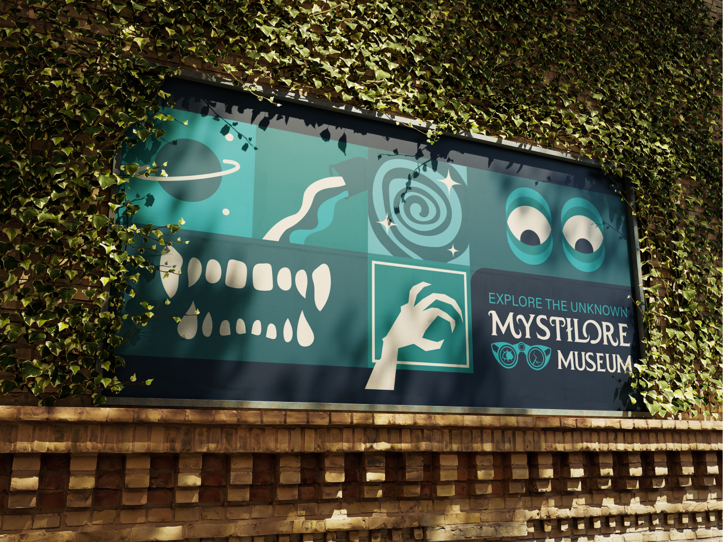
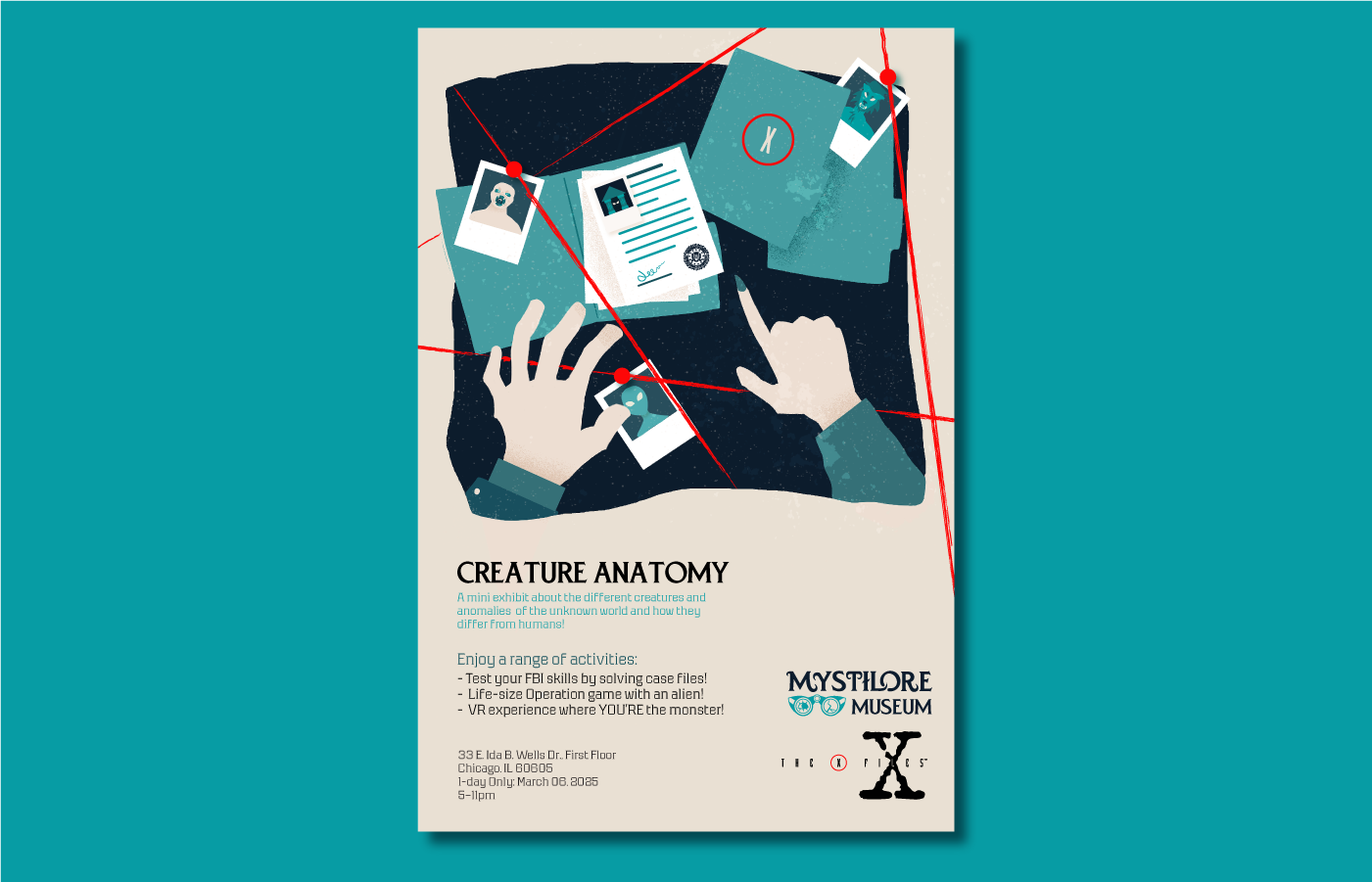
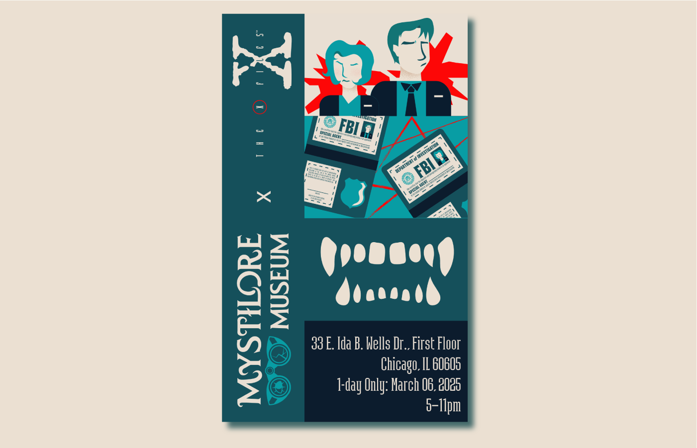
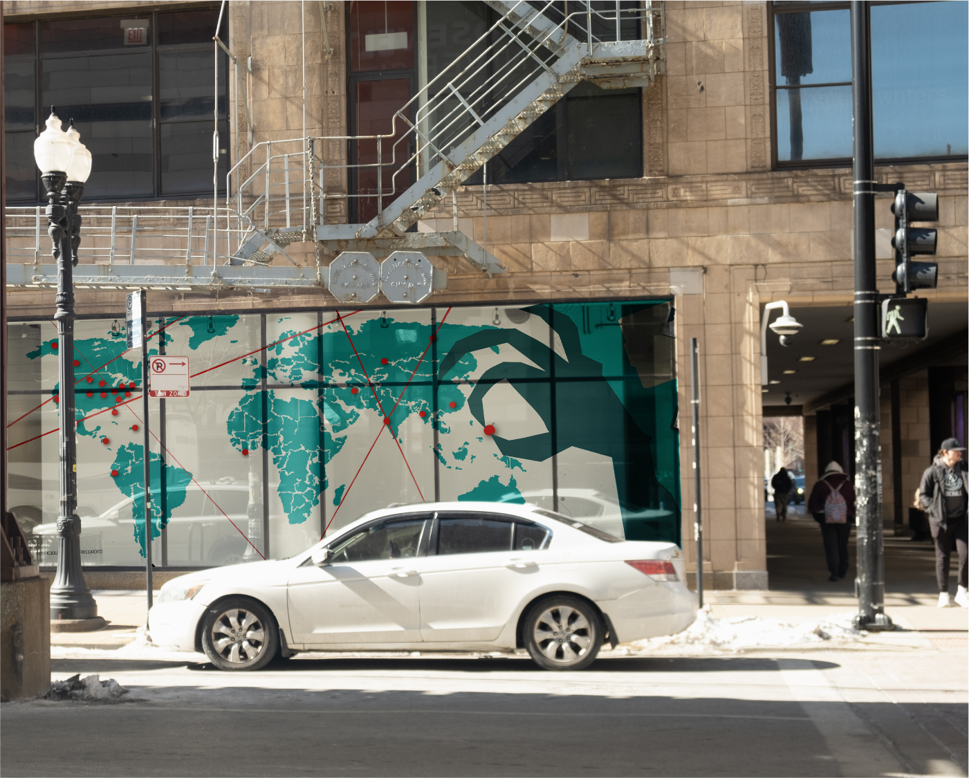
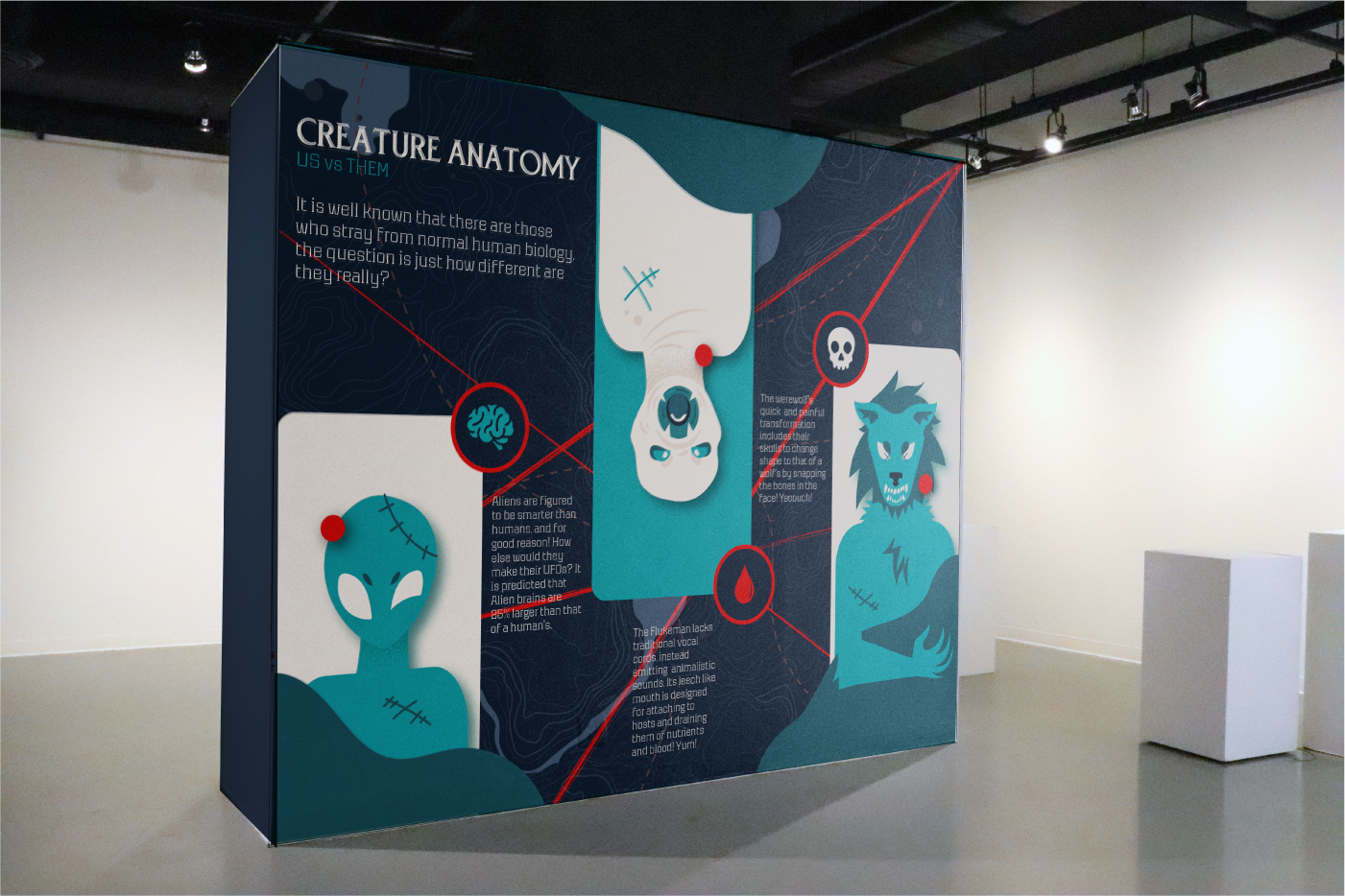
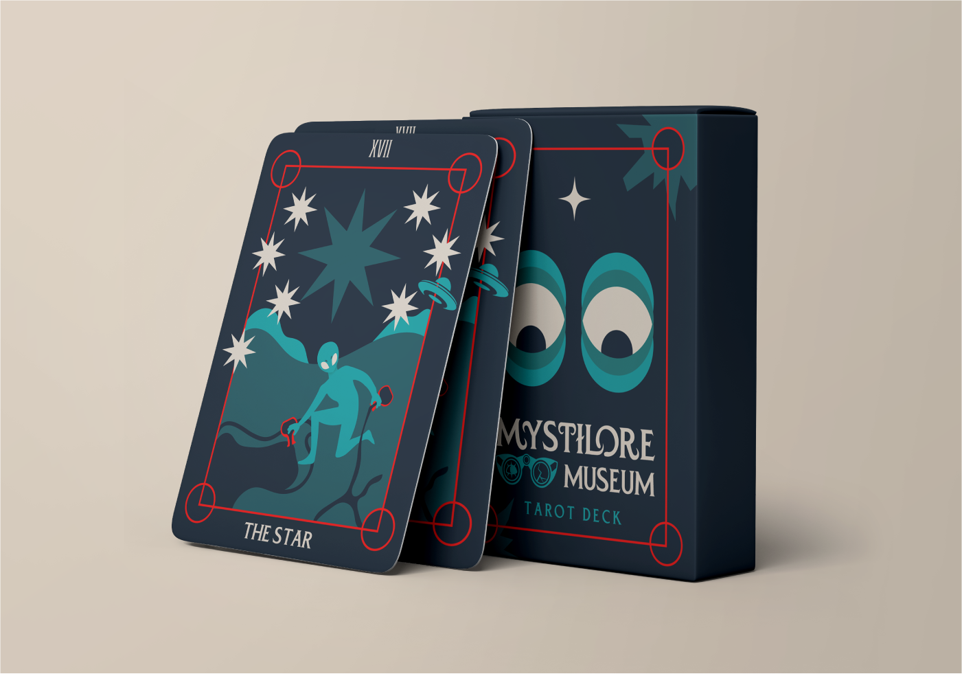
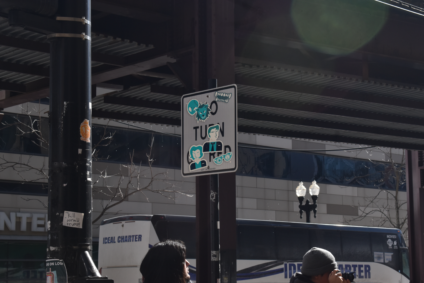
MYSTILORE MUSEUM
The project was to create a fictional brand for a location of any choice with a logo, brand identity, and then to later to create a fictional pop-up shop that fits the location and what it offers.
Mystilore is a museum that focuses on the unknown aspects of the world such as the supernatural, folklore, conspiracy theories, cryptids, and other sources of horror and mystery stories.
I have always been fascinated by the unexplained things in the world and I wanted to create a museum that could reflect on those tales and be able to bring to light the history and art based on these stories.
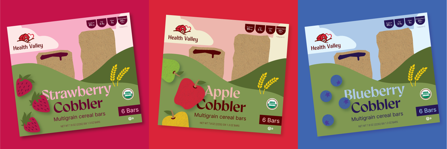
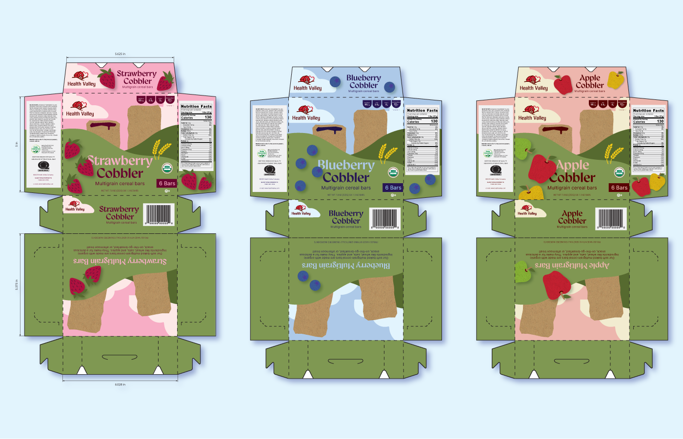
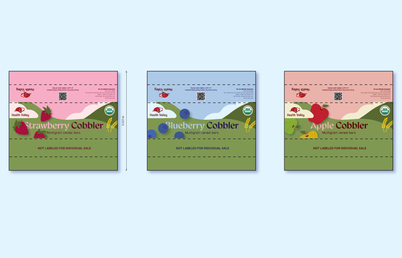
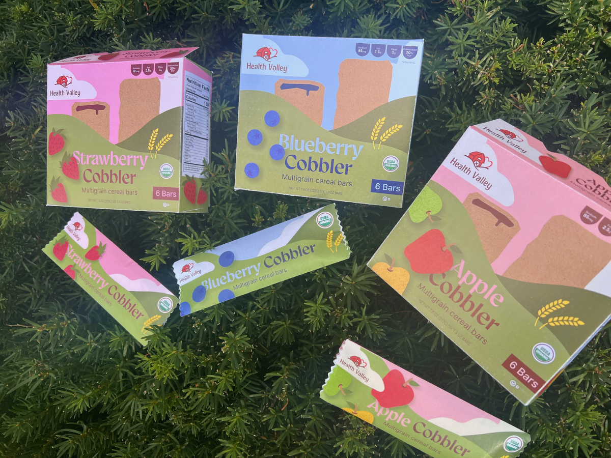
HEALTH VALLEY
The purpose of this class project was to pick a pre-existing brand after searching in stores and redesigning it based completely which includes logo and packaging.
Health Valley is a brand owned by The Hain Celestial Group, Inc. They offer multigrain cereal bars in many flavors and are healthy snacks contain no trans fats, high fructose corn syrup, or artificial preservatives. For my rebrand, I redesigned their old cereal bar products and really wanted to embrace the warm, welcoming feeling to make the rebrand feel welcoming and rooted in nature.
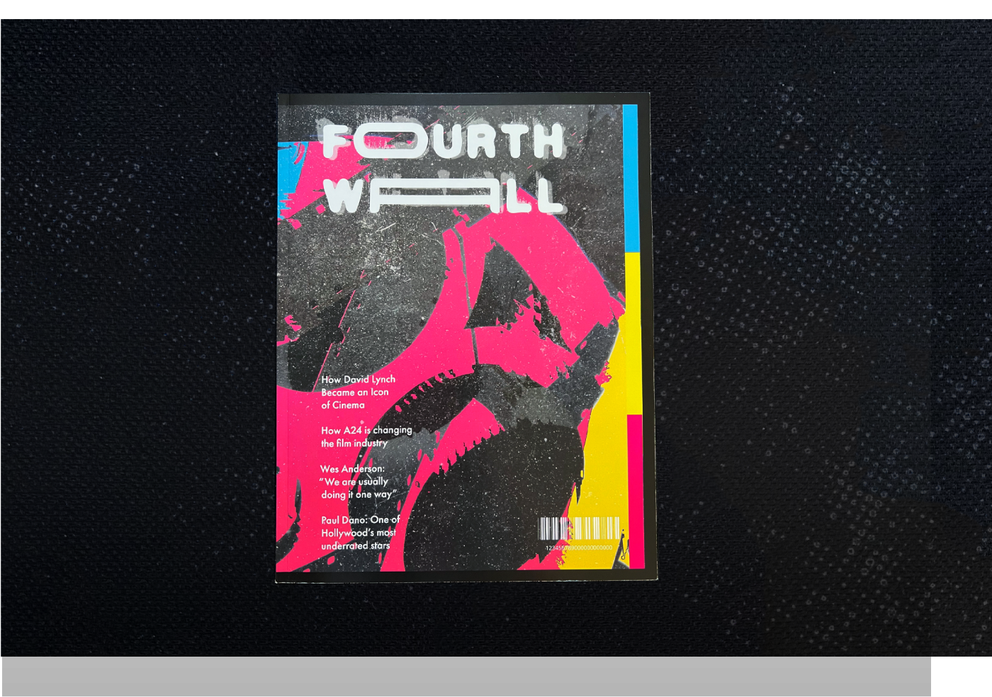
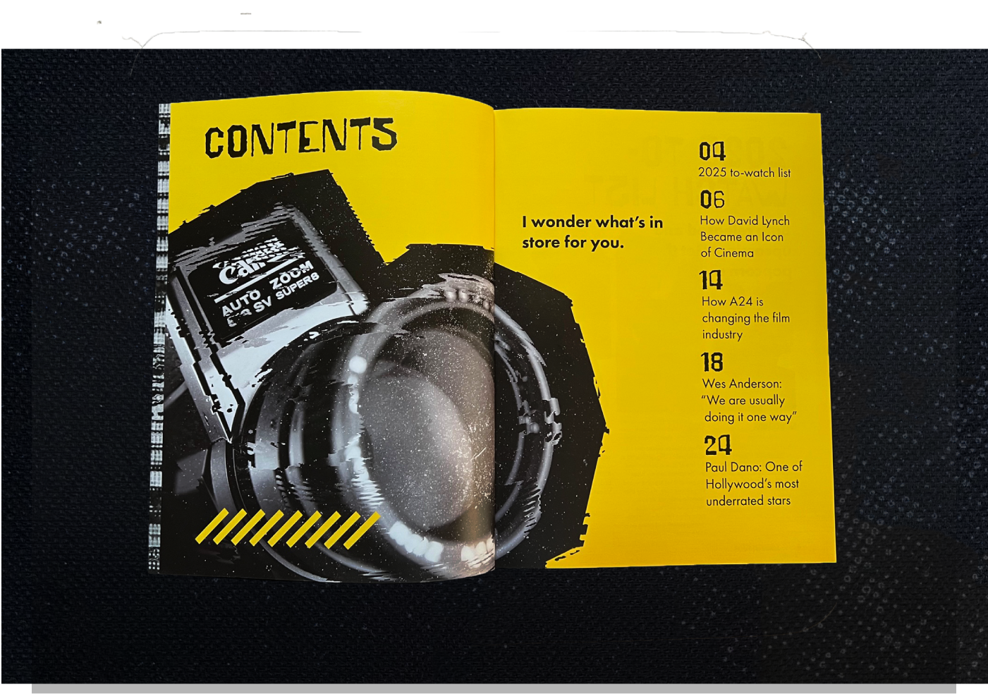
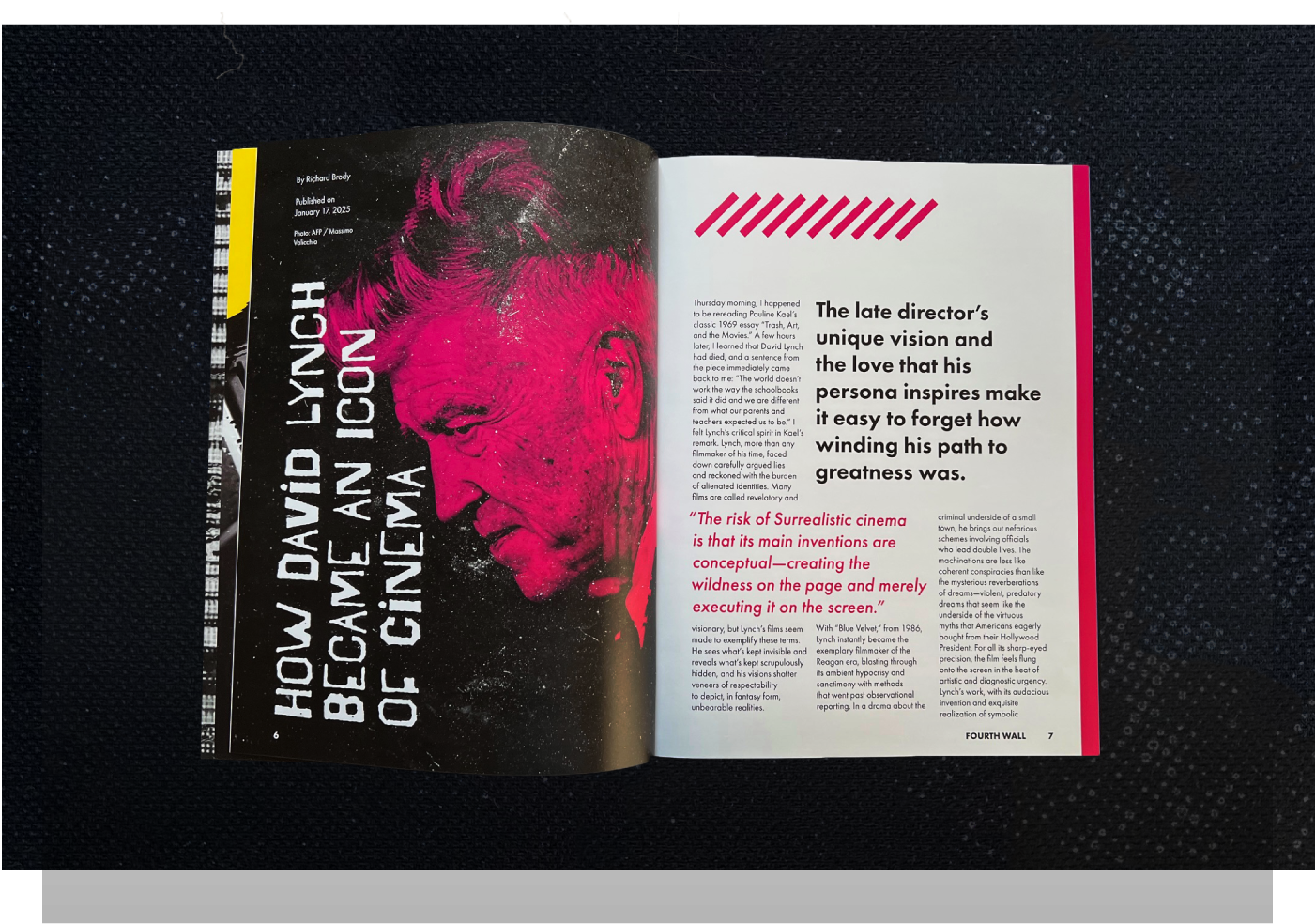
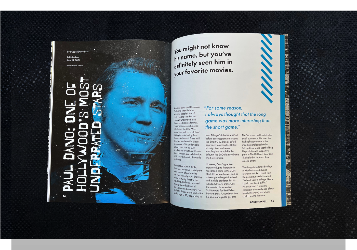
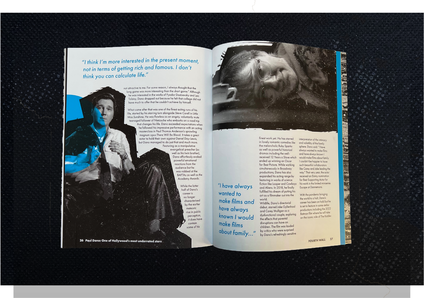
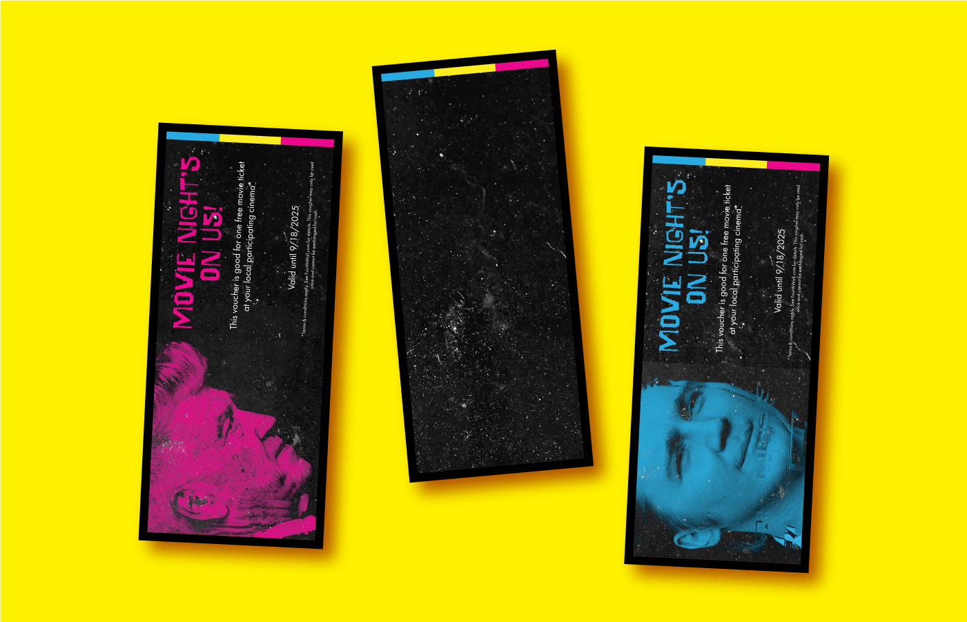
FOURTH WALL
The project was to create a magazine of the topic of your choosing and to create a logo and identity around it.
Fourth Wall is a magazine publication project in which the main subject is about movies, actors, and all events surrounding the film and TV industry!
I, of course, used this as a perfect opportunity to talk about my favorite actors and films in an effort to show the world my appreciation while also adhering to the taste at hand of advertising future and upcoming events as well within the industry.

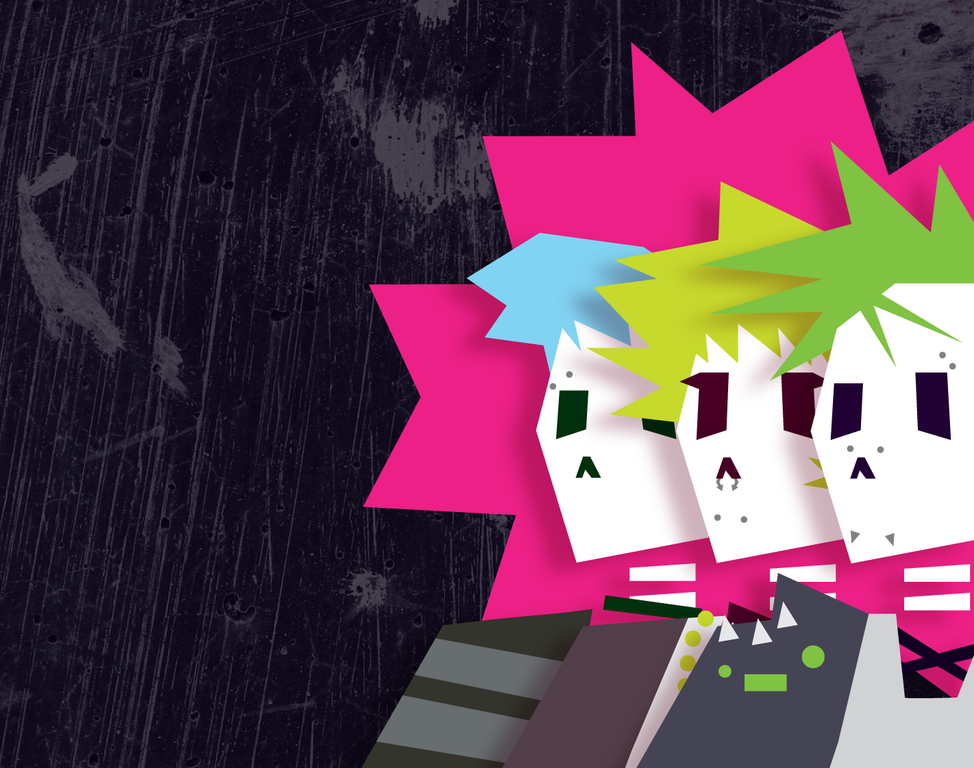
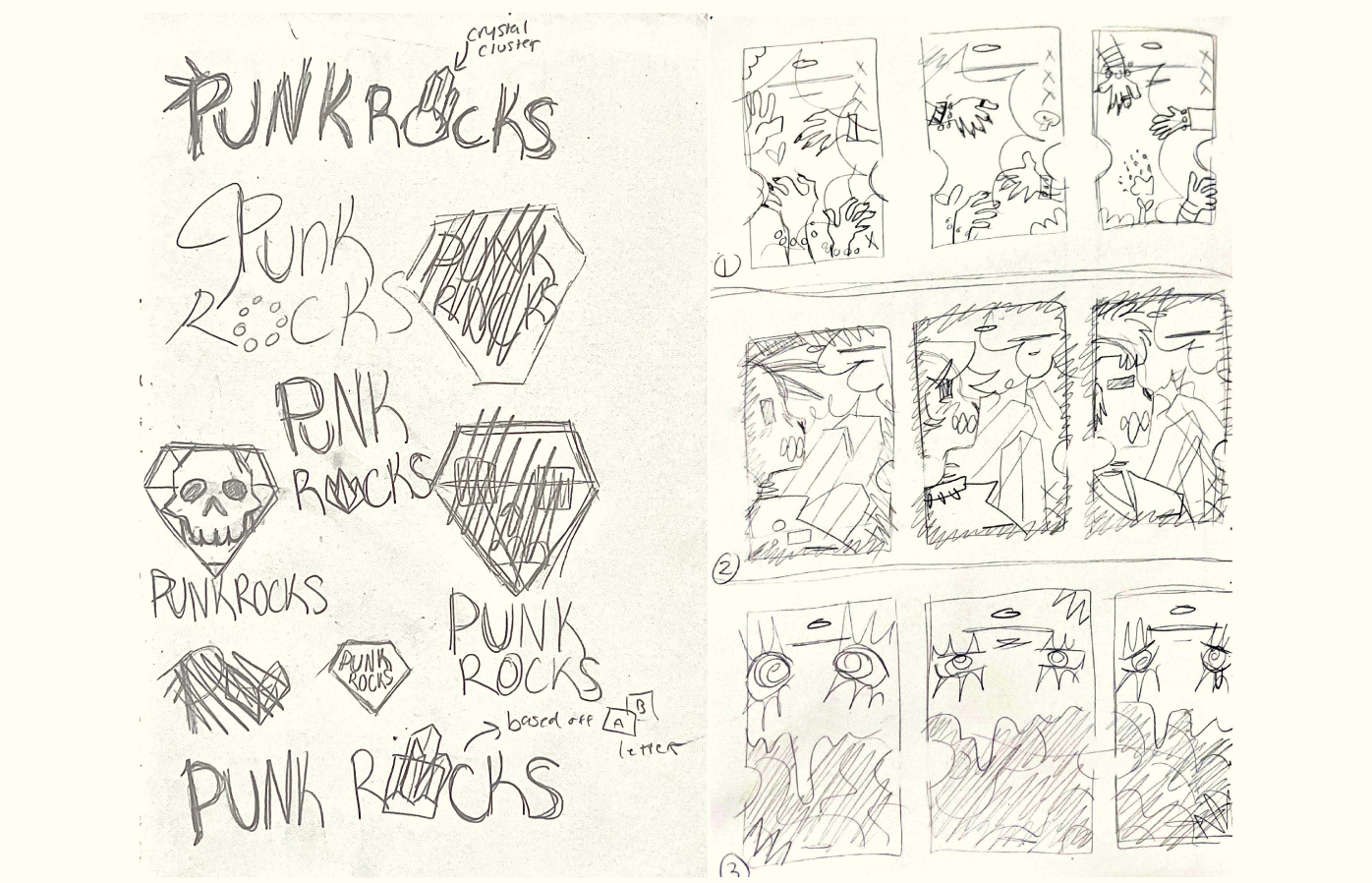
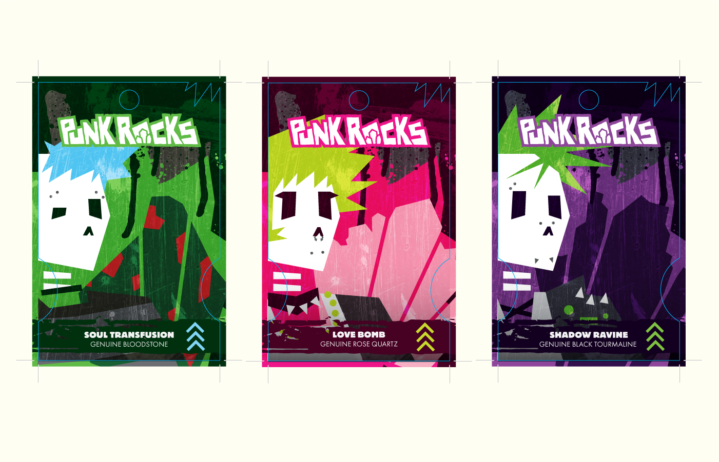
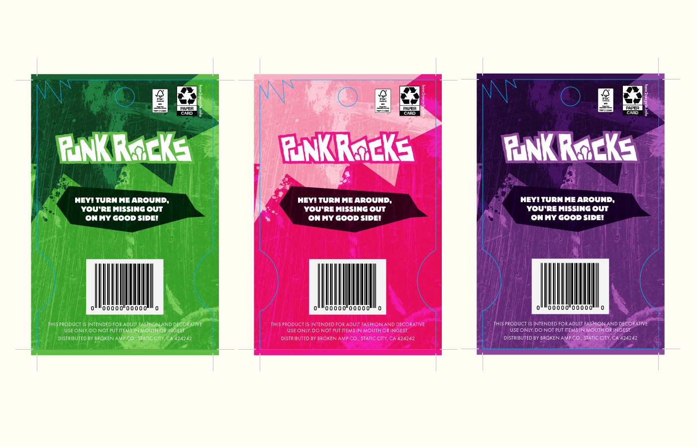
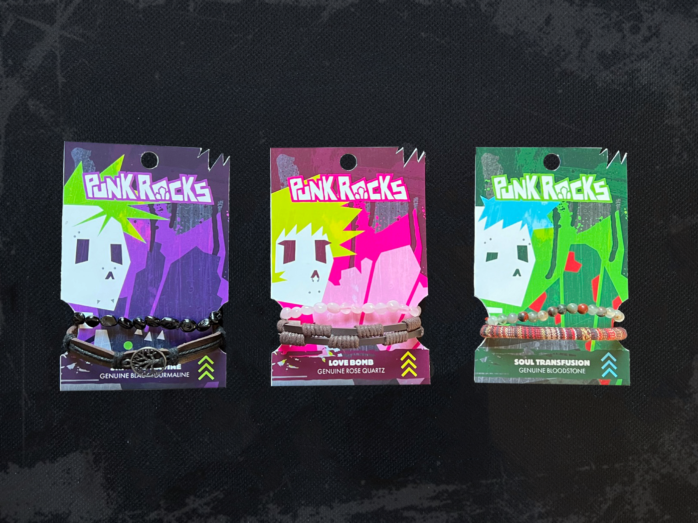
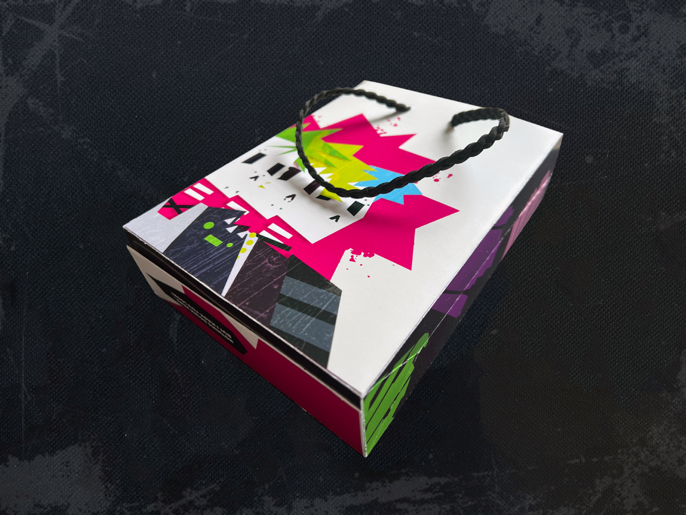
PUNK ROCKS
The project was to create your own branding and imagery for a unique project and customized packaging that compliments the brand.
Punk Rocks takes crystal bracelets in combination with alternative styled leather bracelets for a selection of fun accessories with elements from nature. I really wanted to push the illustrative aspect to stray away from the simplistic and feminine packaging trend for accessories.
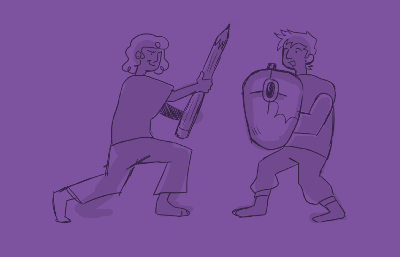
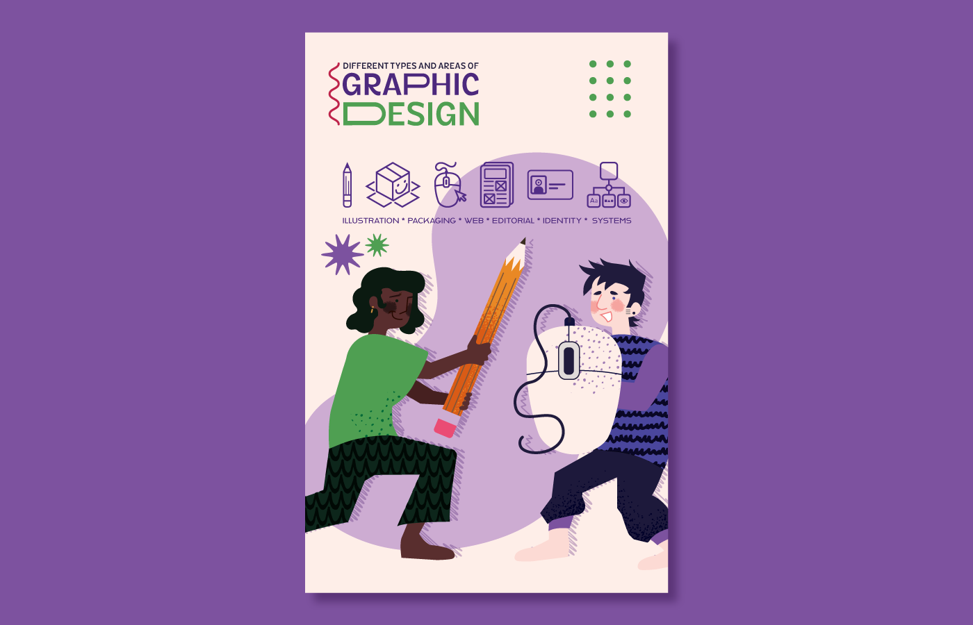
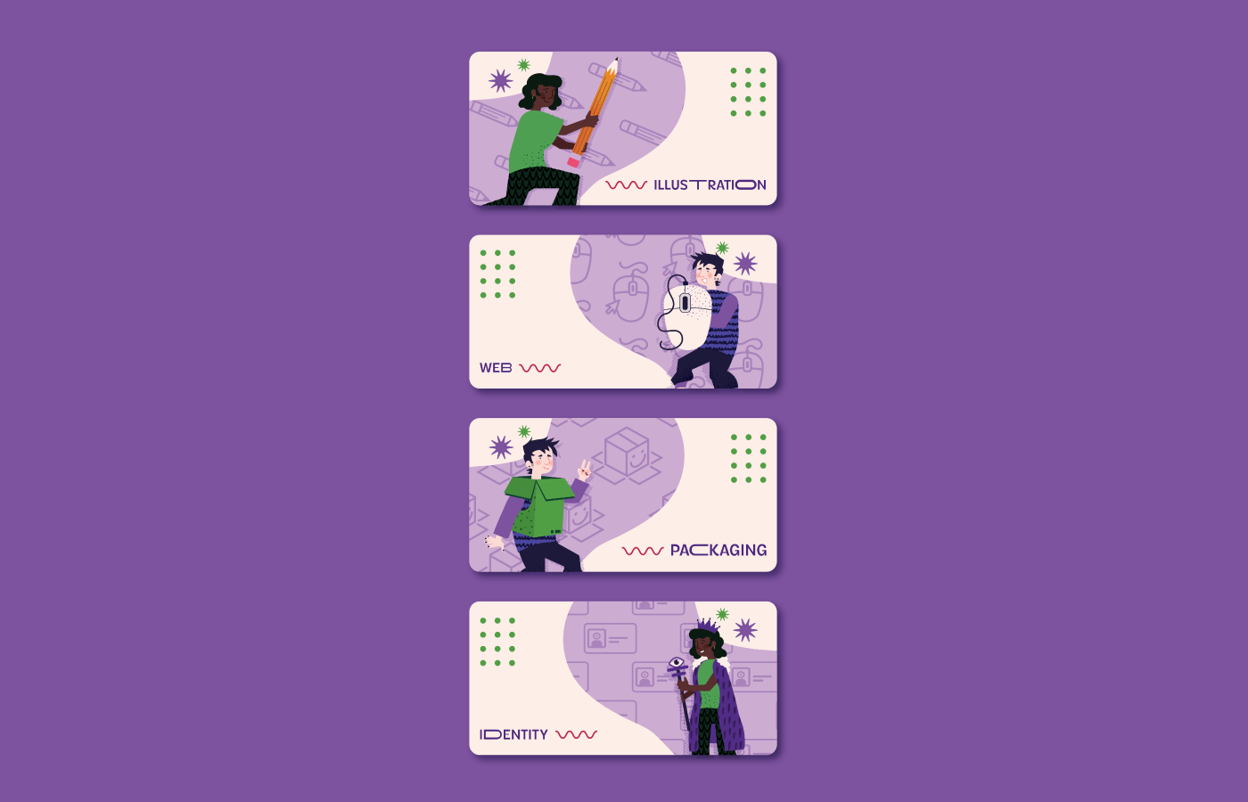
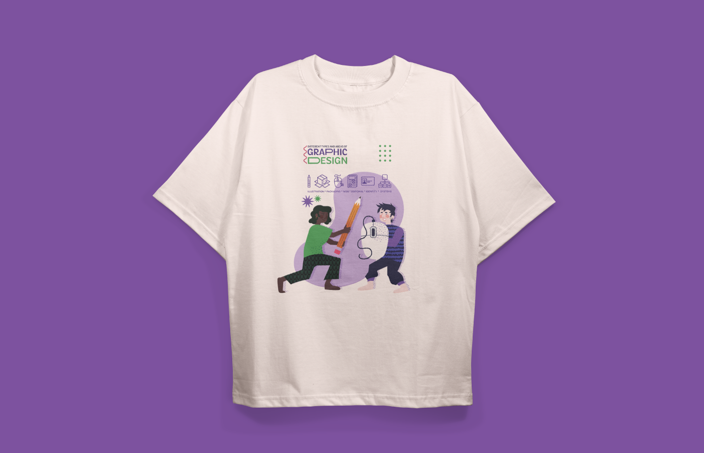
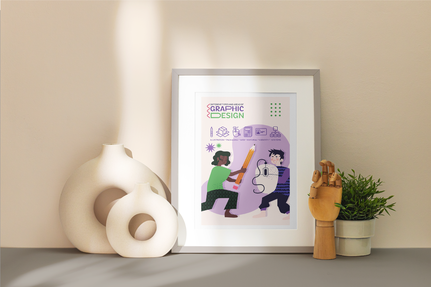
TYPES OF DESIGN
This project is to create a design system that was eventually simplified into showcasing the different types of graphic design through these two characters and symbols.
The idea I wanted to pursue was showing the different types of design as unique weapons or concepts! Pencil sword, computer mouse shield, cardboard box armor, and finally a leader.
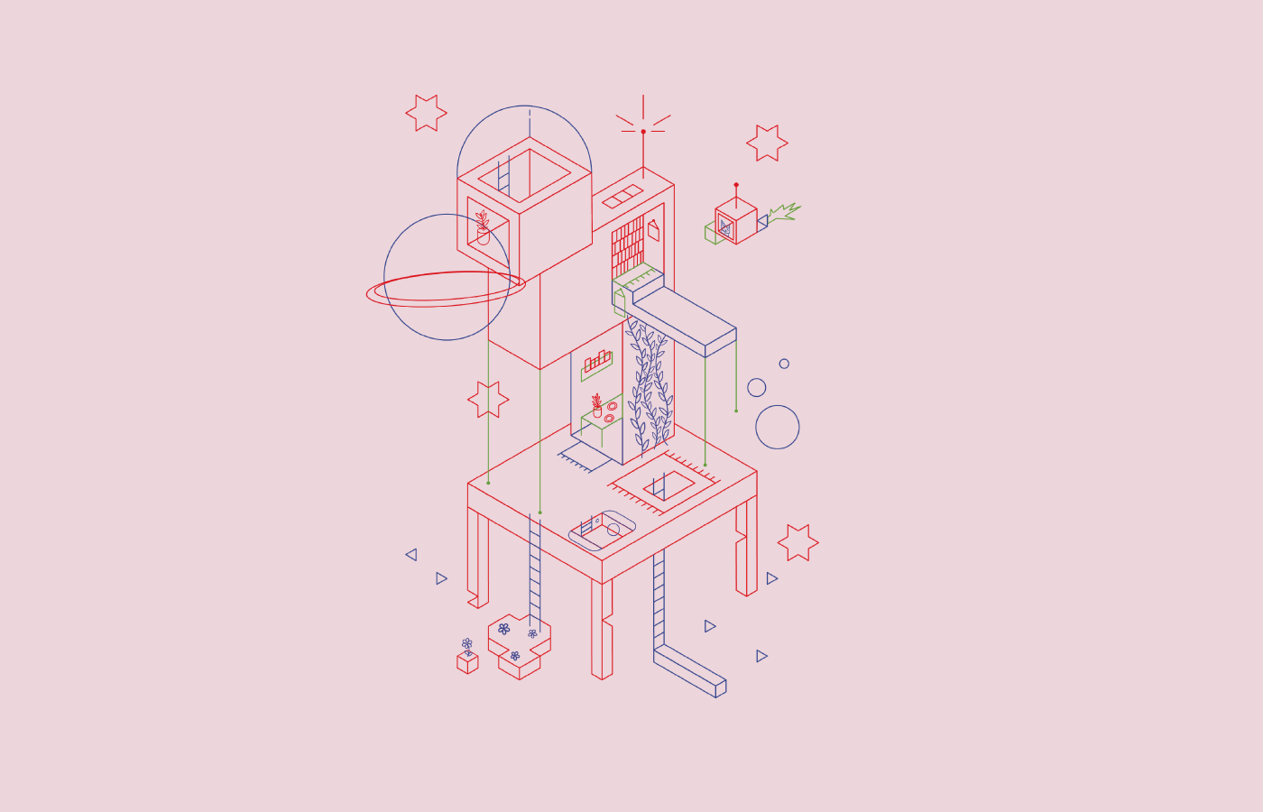
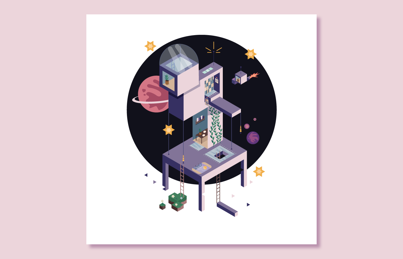
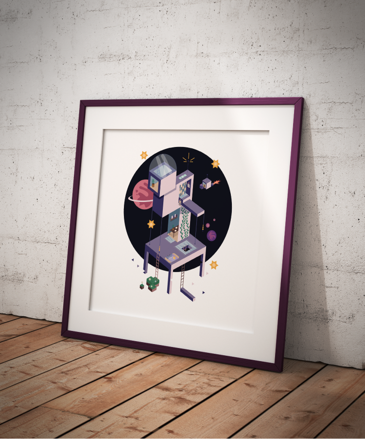
SPACE UTOPIA
The objective of the project was to create an isometric illustration relating to the concept of one's own personal utopia.
My personal utopia is related to the beauty and peacefulness of space. I am really fond of comfortable and simple architecture and living, so I wanted to incorporate that along with features that are not entirely practical to add charm to the buildings.