EMILY SUN
Emily Sun is a multidisciplinary designer and visual storyteller whose work is shaped by her Chinese-American identity and cross-cultural experiences. She approaches each project with intention and attention to detail, exploring balance, narrative, and emotional resonance across design, illustration, and small business practice. Her process is rooted in curiosity and experimentation, creating work that feels personal, thoughtful, and culturally connected.
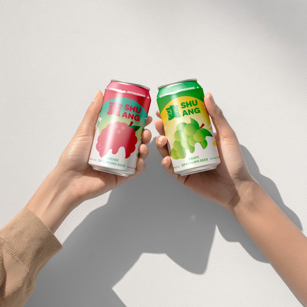
SHUANG BEER
SHUANG (which translates to 'refreshing' in Chinese), is a beer brand I created with a focus on infusing Asian flavors into its brews, the brand seeks to introduce a distinctive taste to the world of beer.


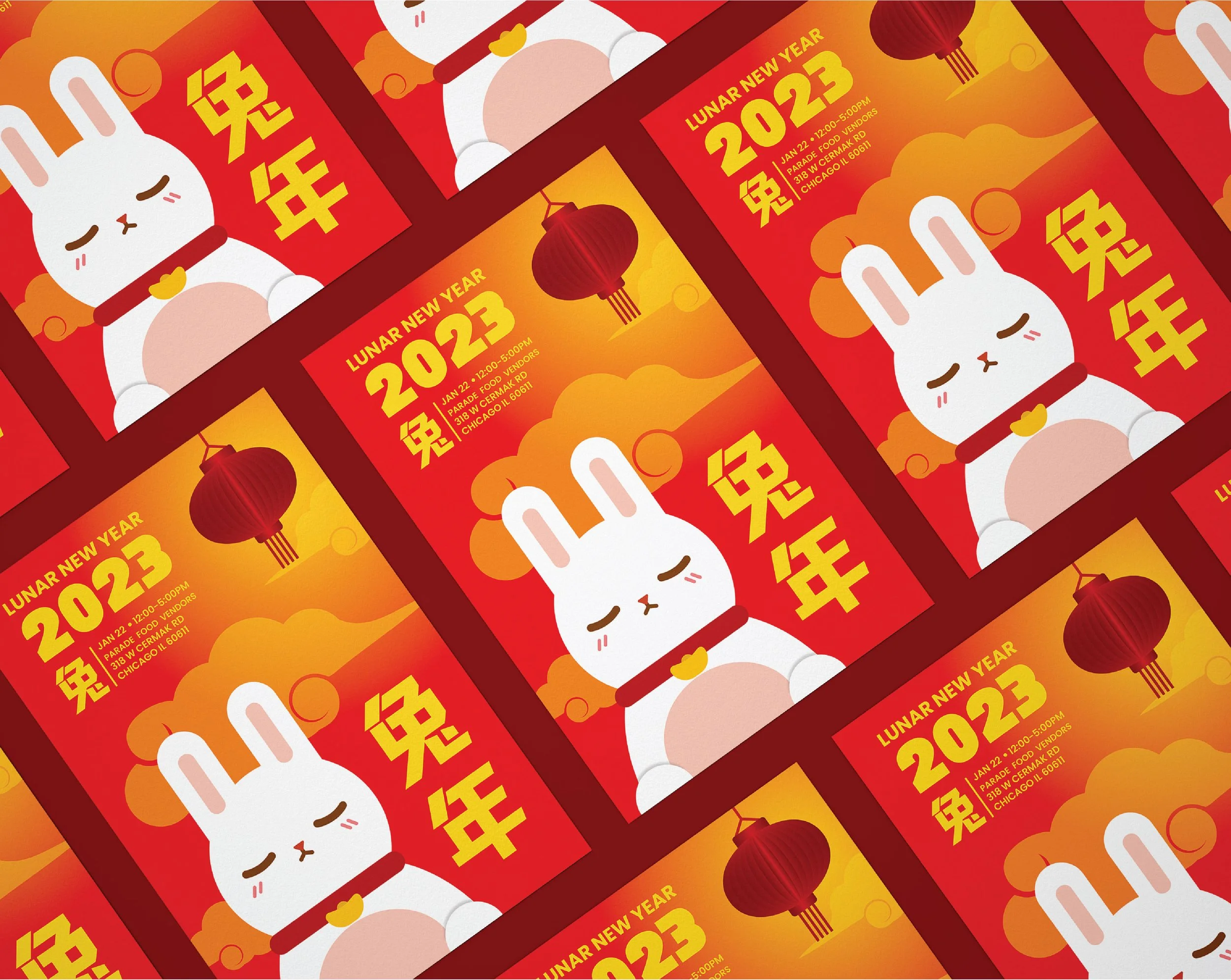
YEAR OF THE RABBIT
This series was created to celebrate the Year of the Rabbit. A poster and banner were designed to inform people about the Lunar New Year celebration. Red and yellow are recognizable colors often used in New Year celebrations, as they are also used to symbolize luck and prosperity. The stamp stickers are used for stationery and to attract people to the event.


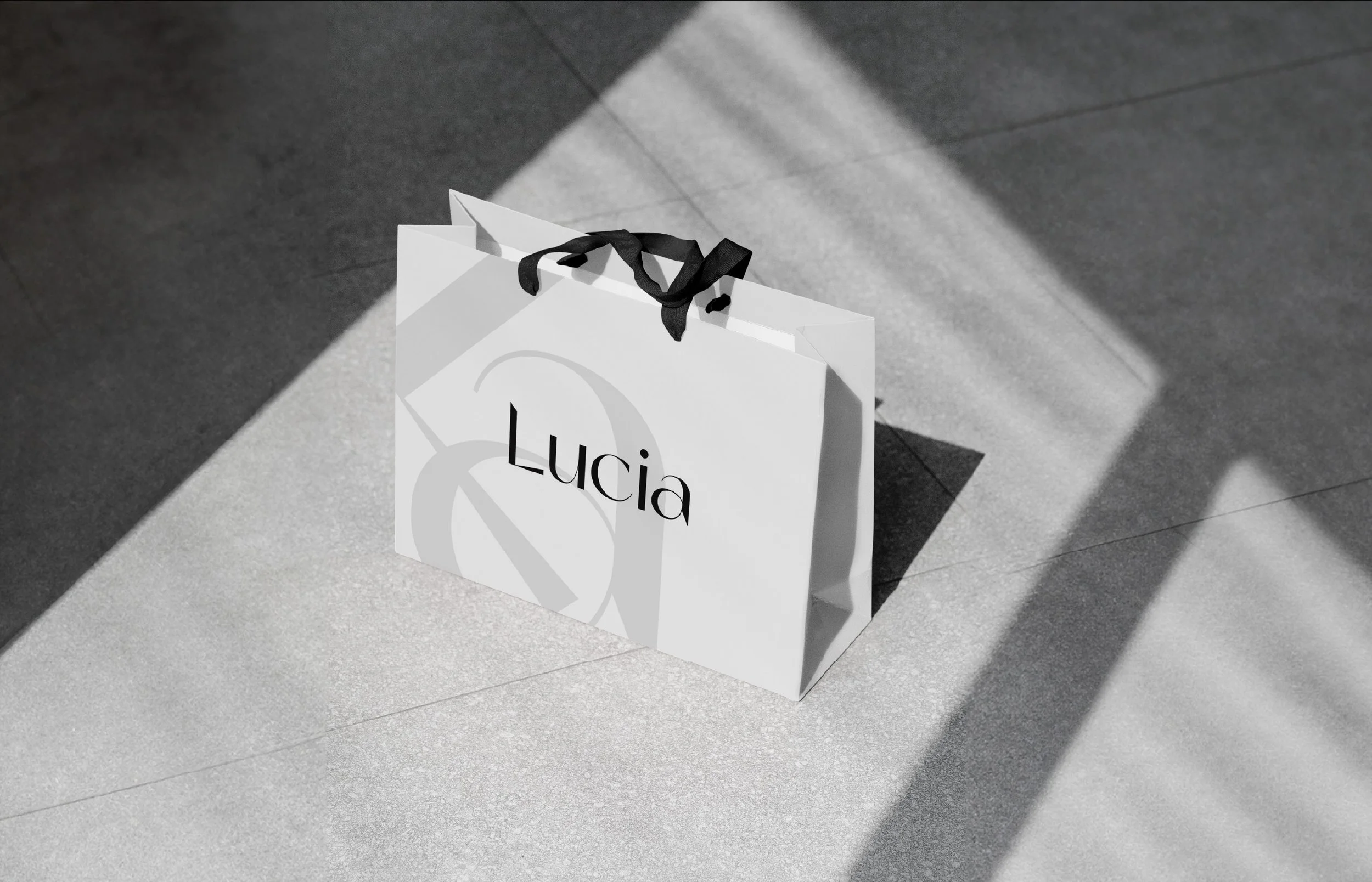
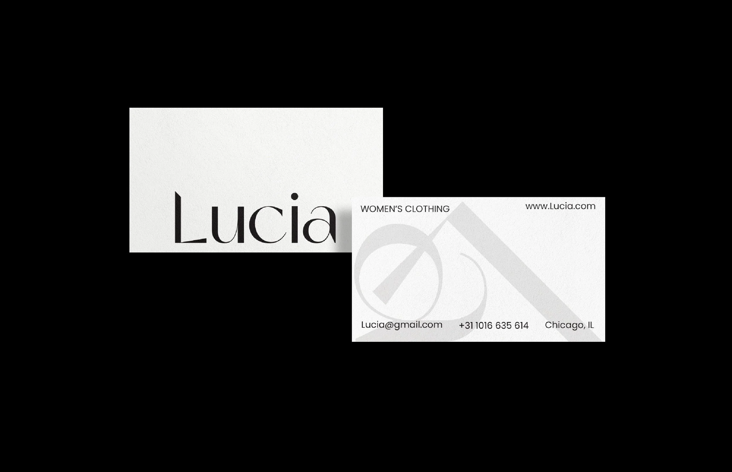
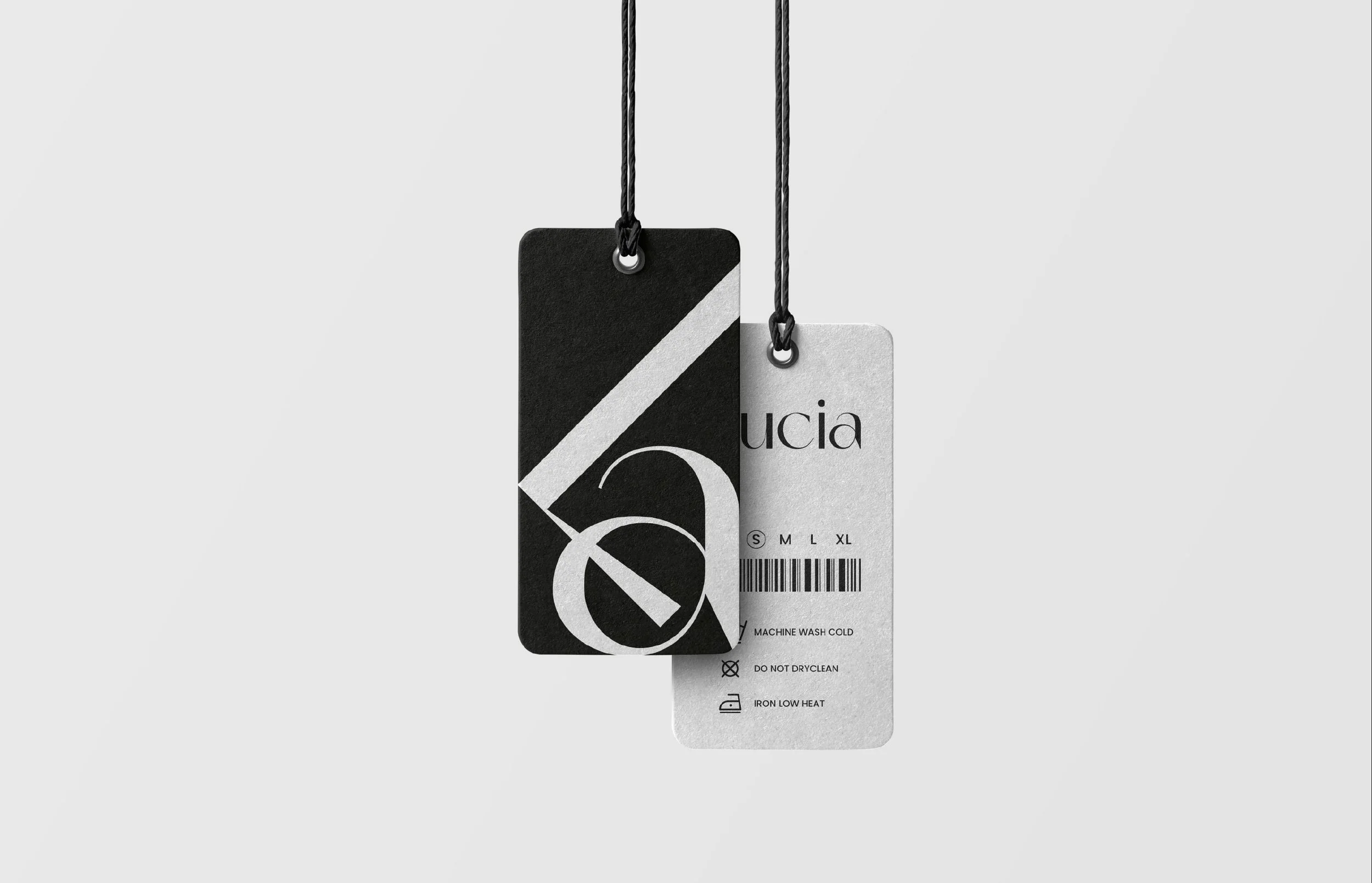
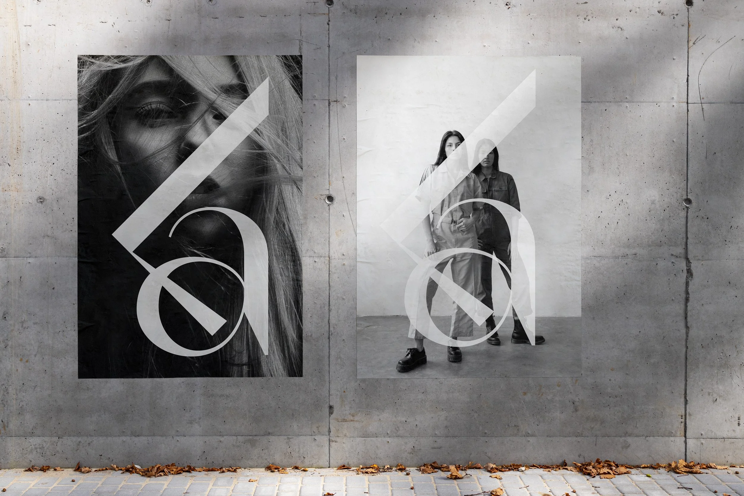
LUCIA
Introducing Lucia, the epitome of refined luxury in women's fashion. Our branding for this high-end clothing store captures the essence of minimalism and elegance. With a sleek and sophisticated design, Lucia's identity exudes exclusivity and style. From the clean lines of our logo to the understated color palette, every aspect of the brand reflects the timeless appeal of our meticulously crafted garments. Step into the world of Lucia and experience the allure of understated glamour.

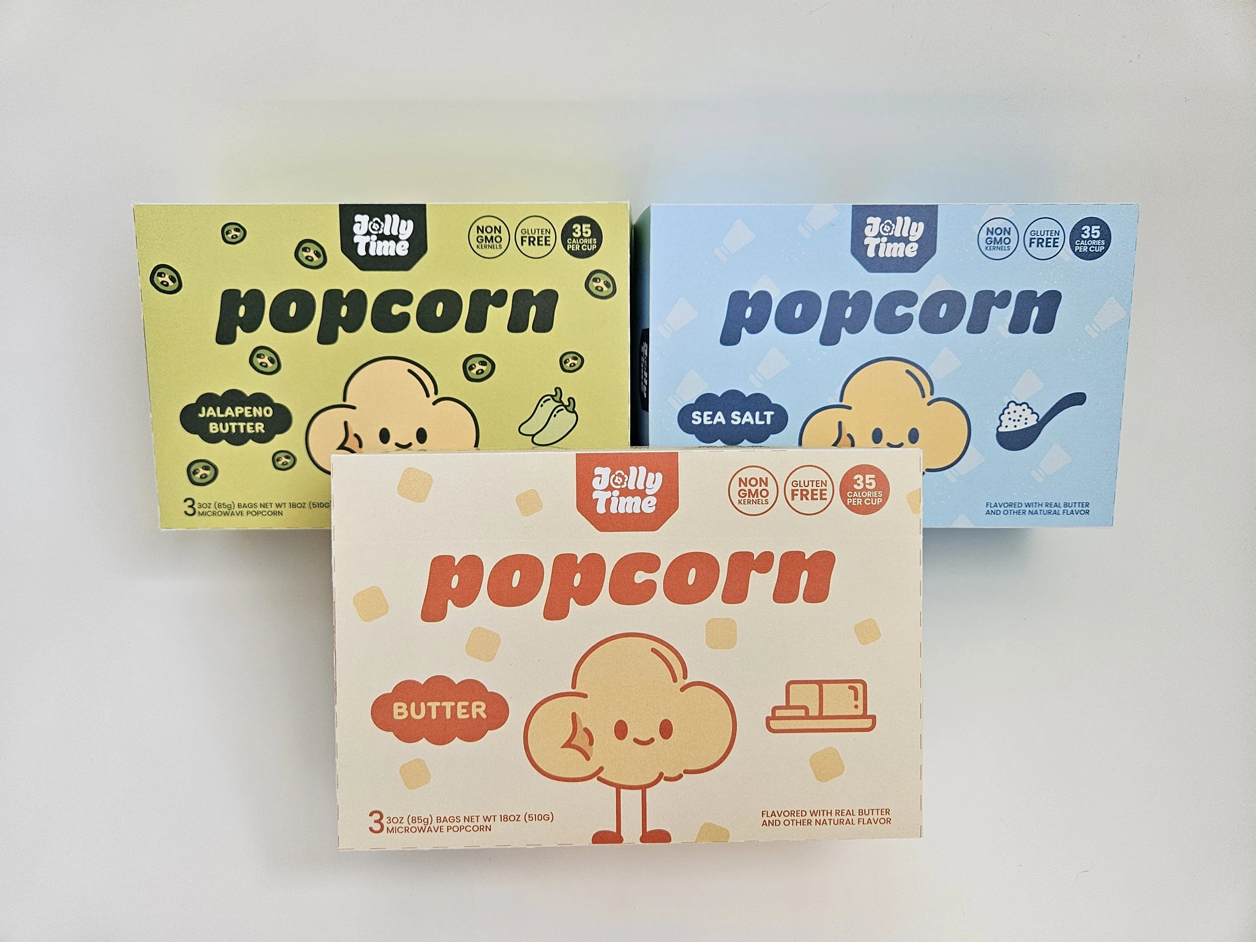
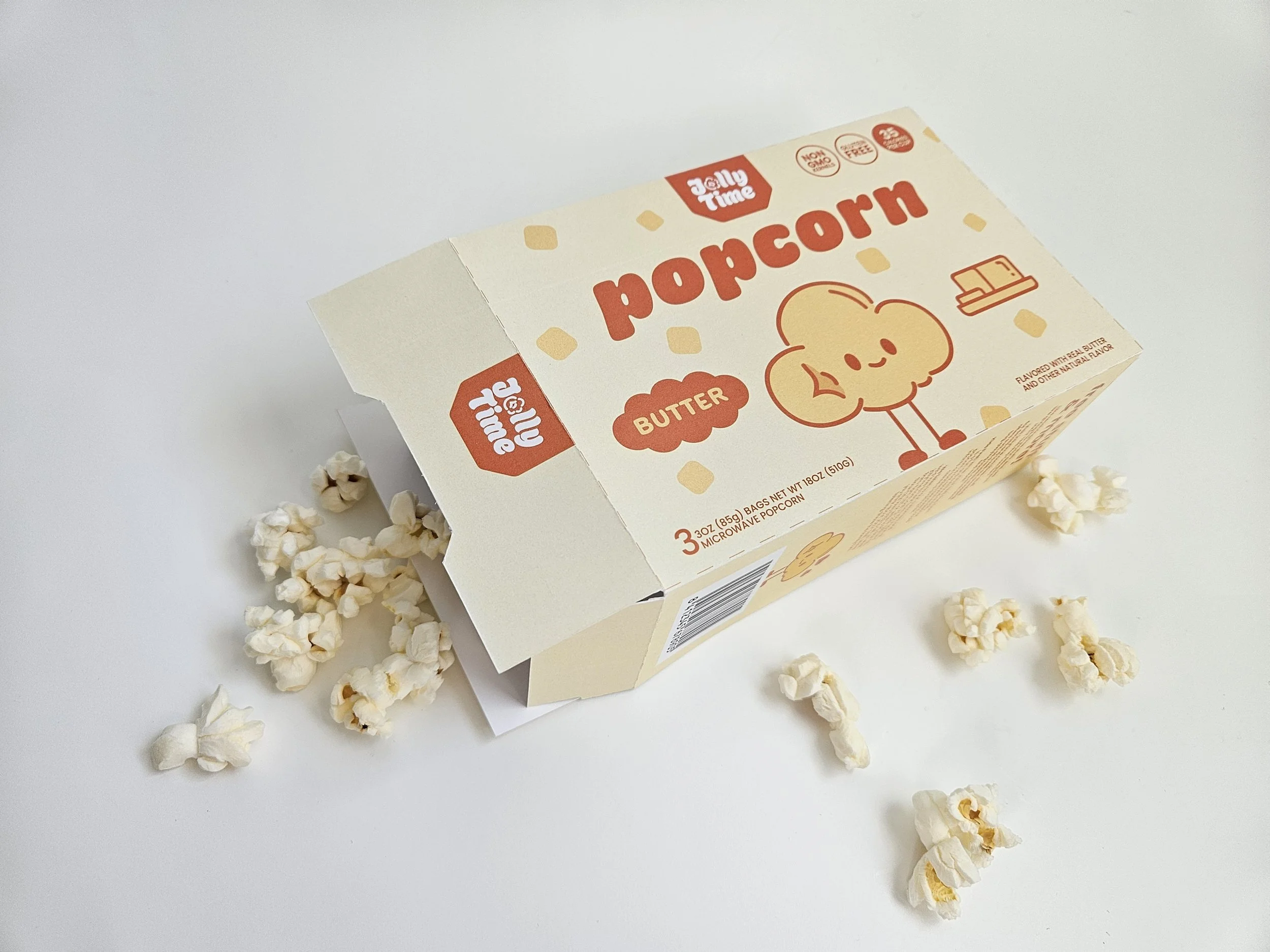
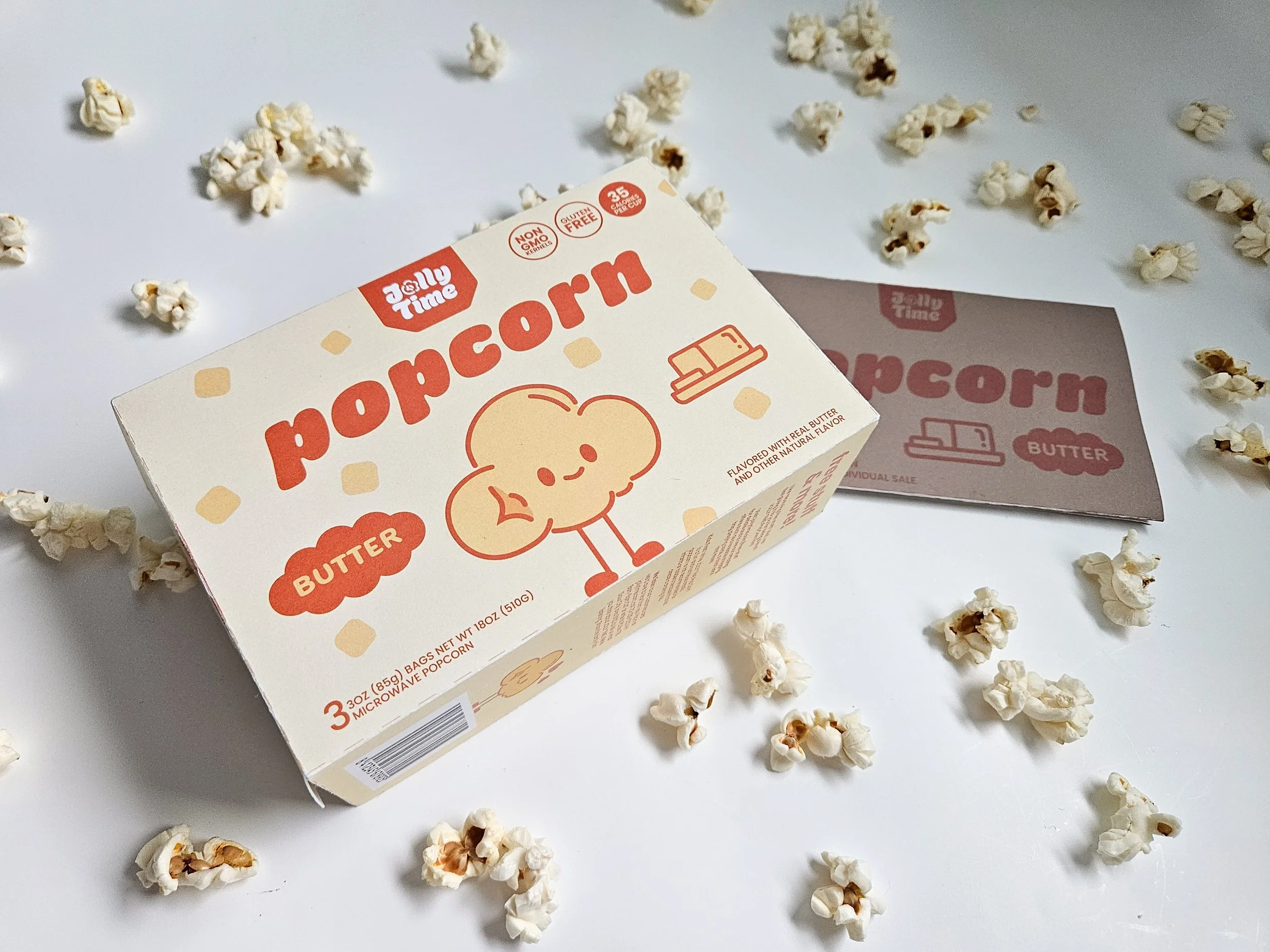
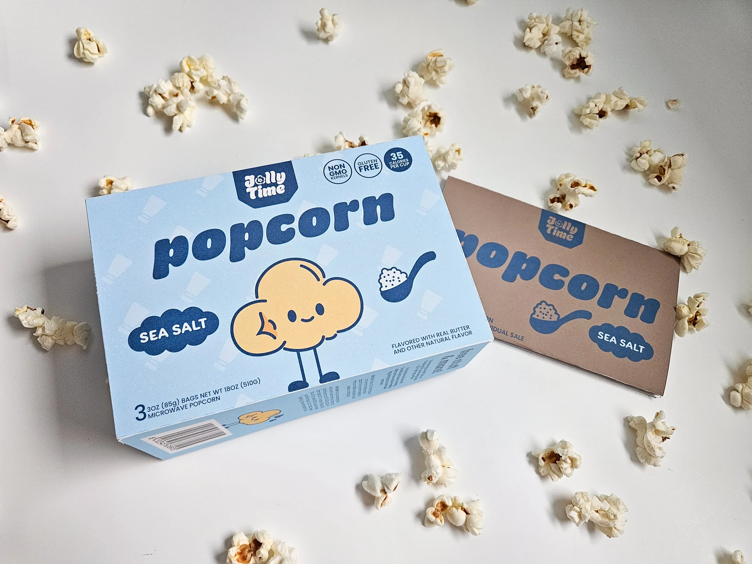
JOLLY TIME
Jolly Time is a family-owned popcorn brand built around bringing joy and togetherness through a simple, shareable snack. What makes the brand unique is its focus on happiness as an experience, not just a product, which is reflected in this rebrand through a playful, character-driven approach. By turning popcorn into a friendly, expressive character, the design creates an emotional connection that feels fun, approachable, and memorable. Combined with a clean, modern visual system and bold color coding, the brand stands out as both nostalgic and fresh, appealing to both kids and parents.

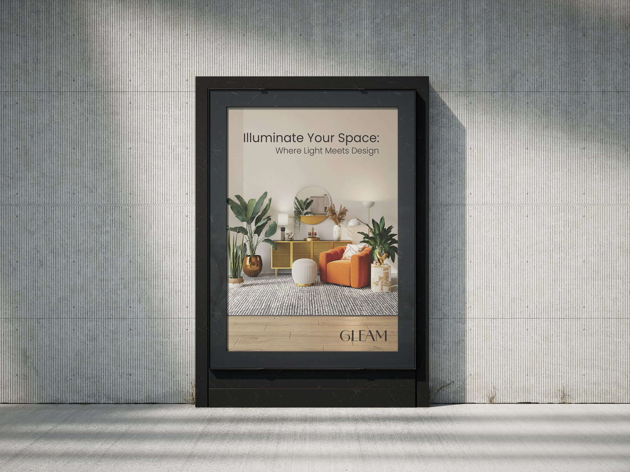
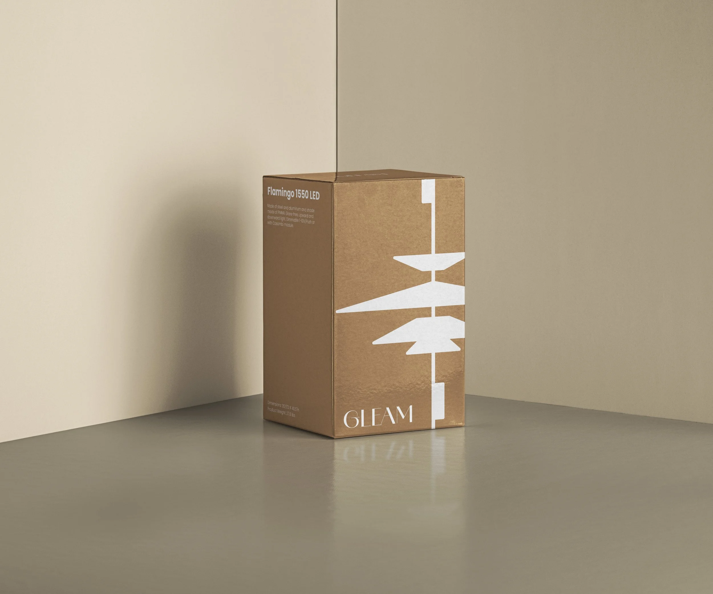
GLEAM MAGAZINE

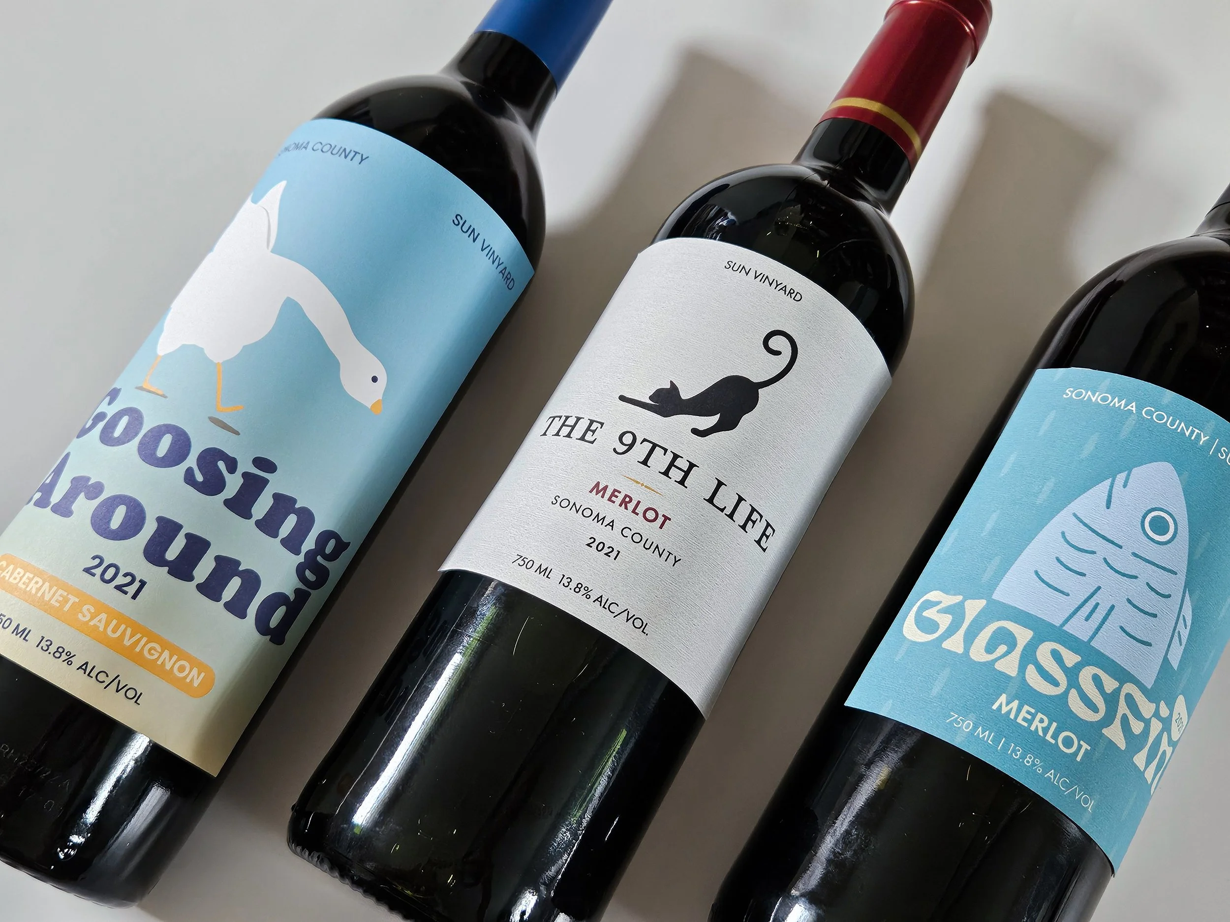
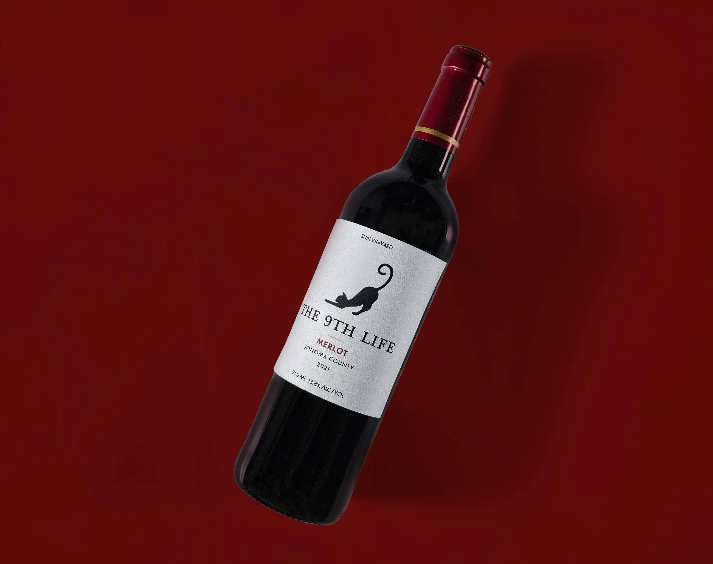
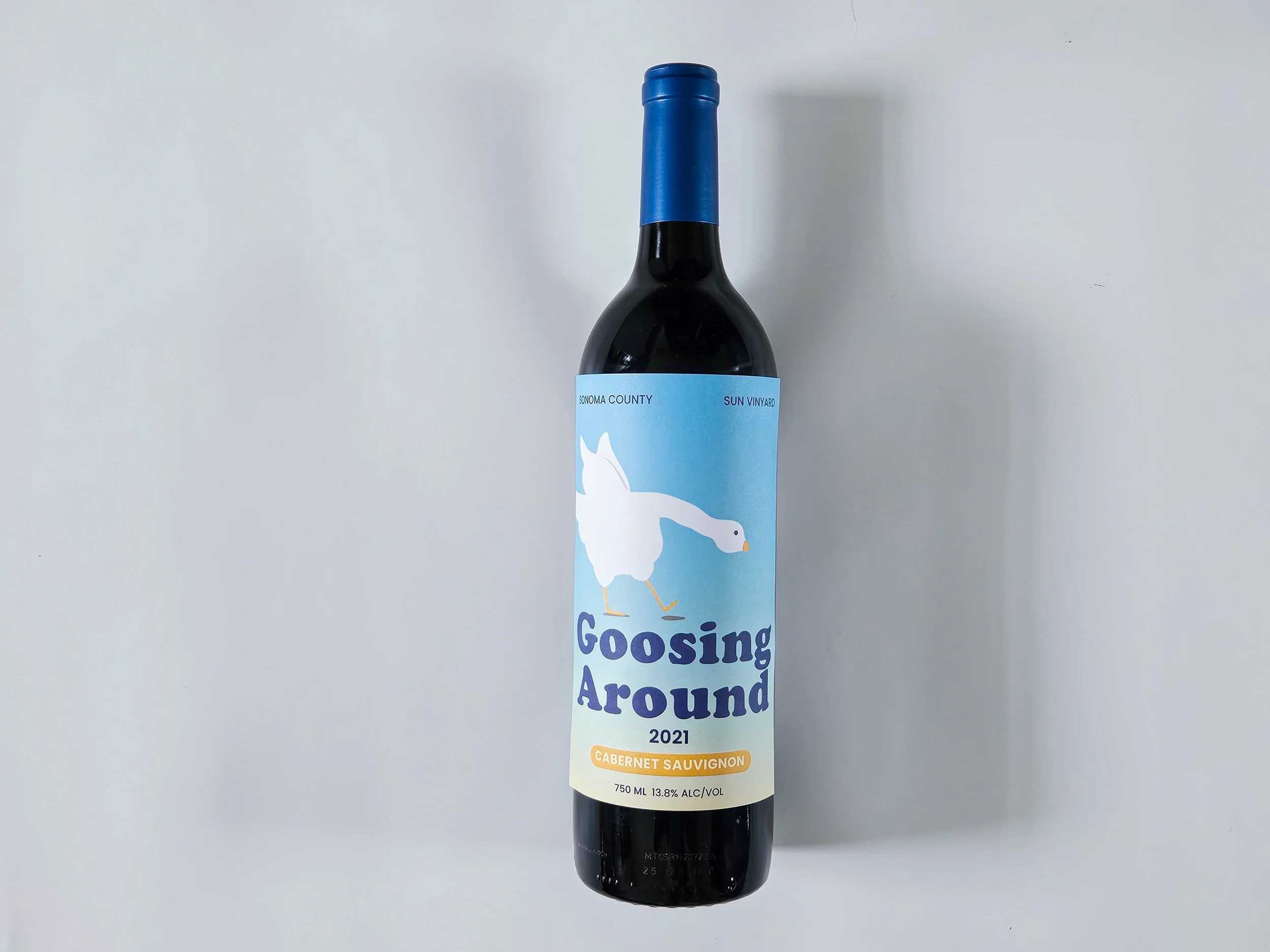
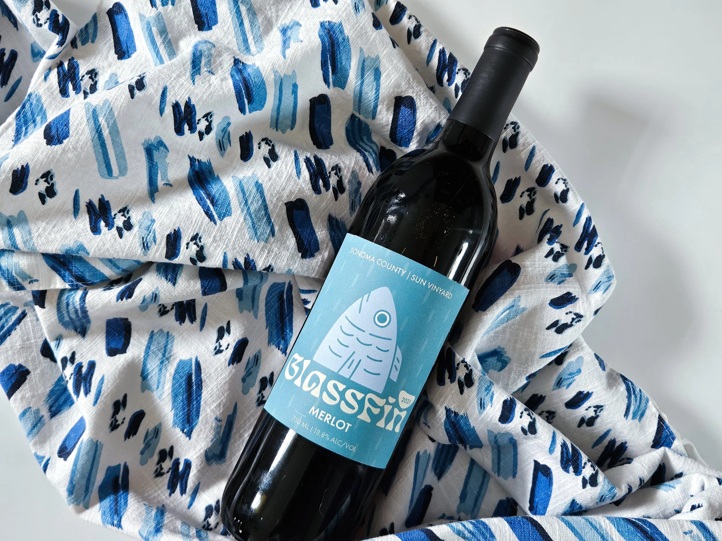
THREE WINES, THREE MOODS
For this project, I set out to design a series of three wine labels that each targeted a different market level: low-end, mid-range, and high-end. To start, I went to local stores to study existing labels and noticed clear differences between tiers. The lower-end bottles often leaned into humor, with playful names and bold illustrations. Mid-range labels had a more contemporary look, keeping things simple, clean, and easy to follow. The higher-end wines usually featured vineyard sketches and classic typefaces like serif or cursive, giving them a more traditional and refined feel.