ESMERALDA GARCIA MEJIA
Esmeralda is a multidisciplinary Graphic Designer. She likes to explore the world and learn as much from it as she can. She loves learning about different cultures, people, and places. Esme takes inspiration from this and from her own culture. She believes that there are many beautiful things out there and there is always something to be learned from them. Esme does all kinds of work from photography to painting, however her passion falls in designing. She hopes to keep creating and to inspire others in their creations.
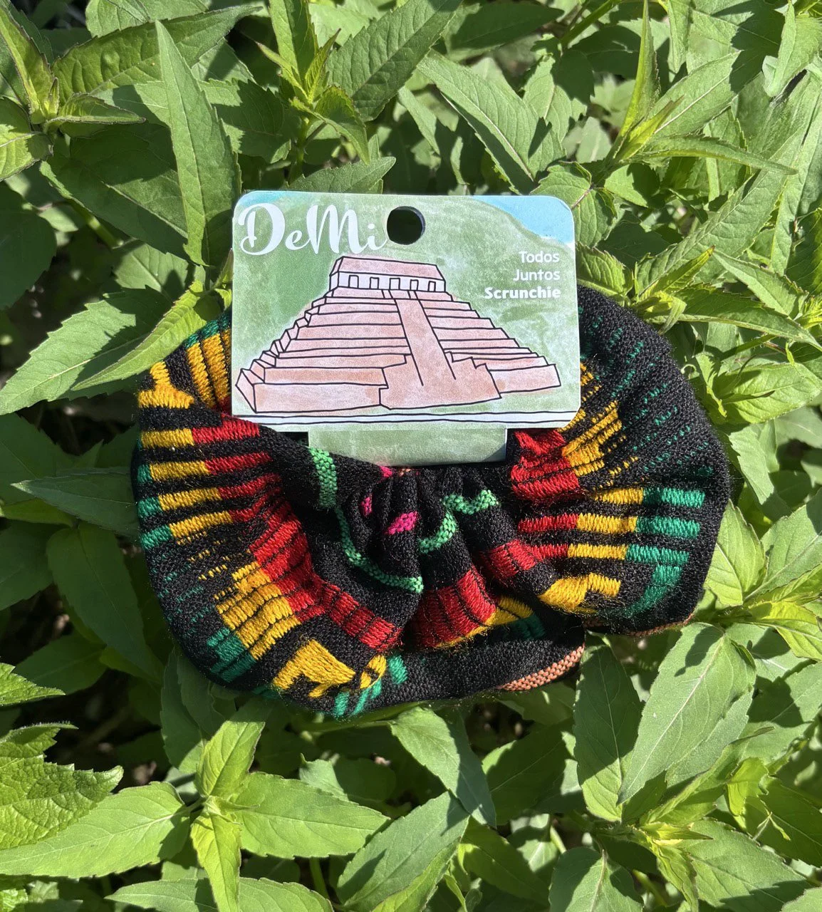
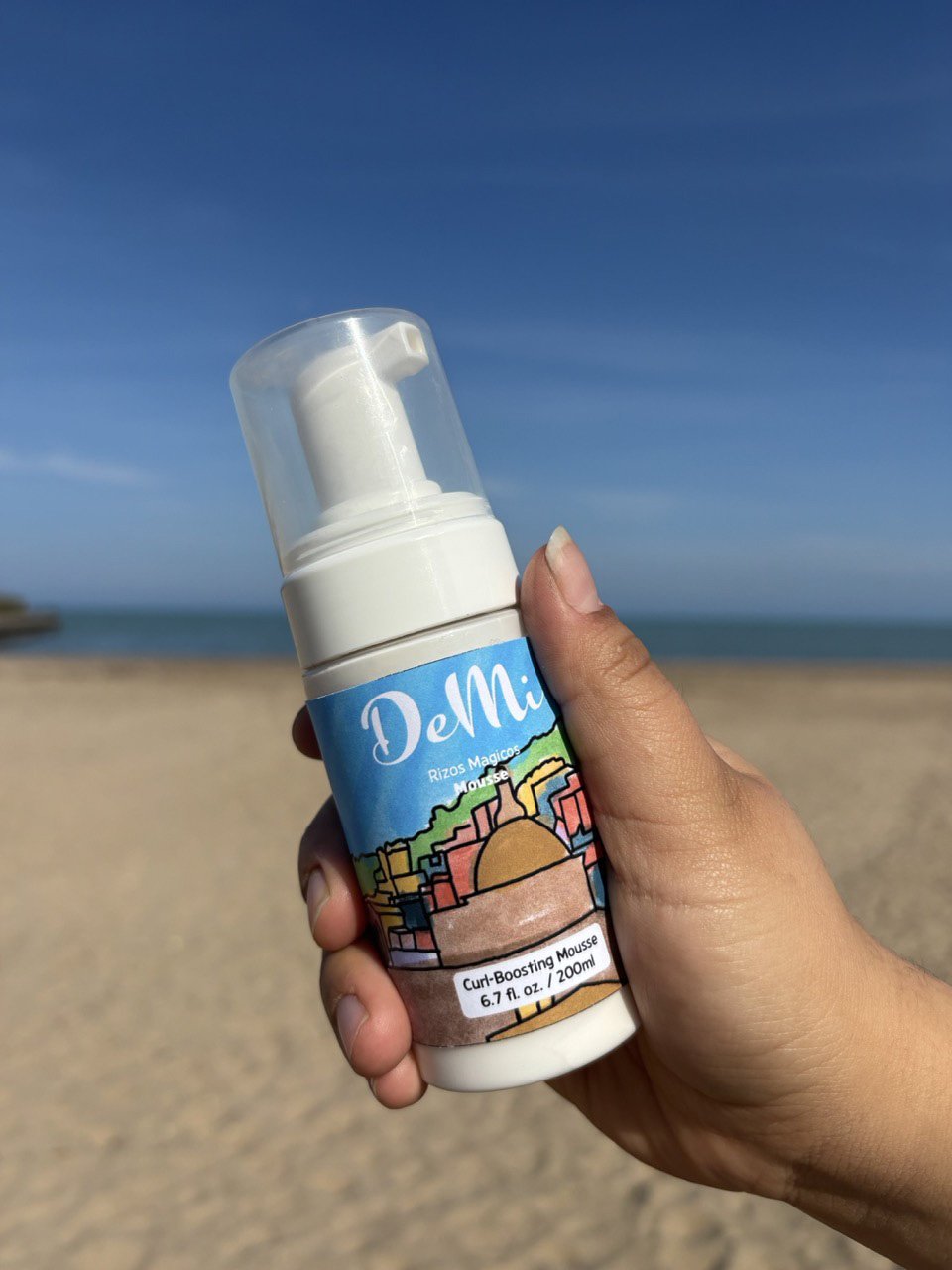
DEMI
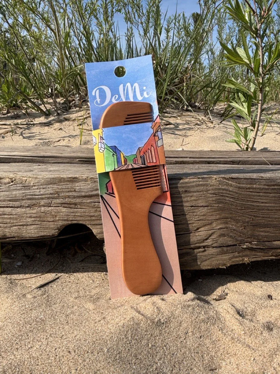
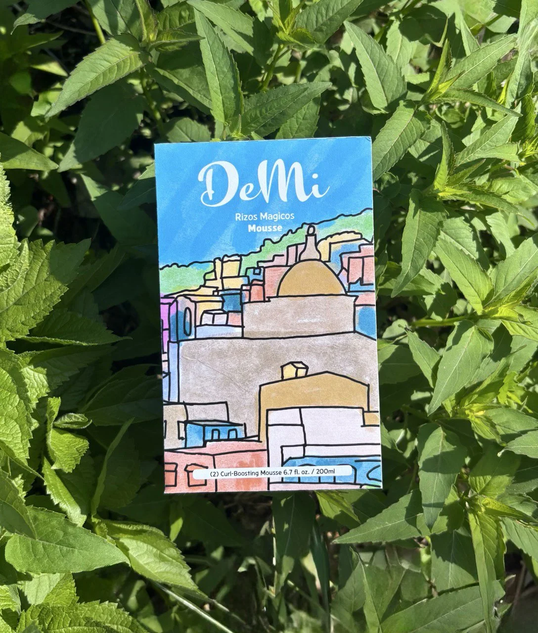
De mi is a culturally driven brand on a mission to create affordable/clean hair products and styling tools. DeMi was inspired from Mexican culture, specifically from the Pueblos magicos (Magic towns). These towns are called pueblos magicos because they have deep and rich historical, cultural, and natural qualities. Which is what I wanted DeMi to represent. This is me giving you a little piece of my culture.
DeMi, para ti
(from me to you)


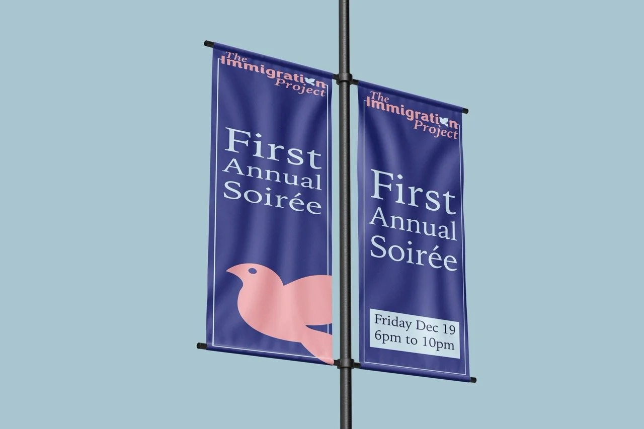
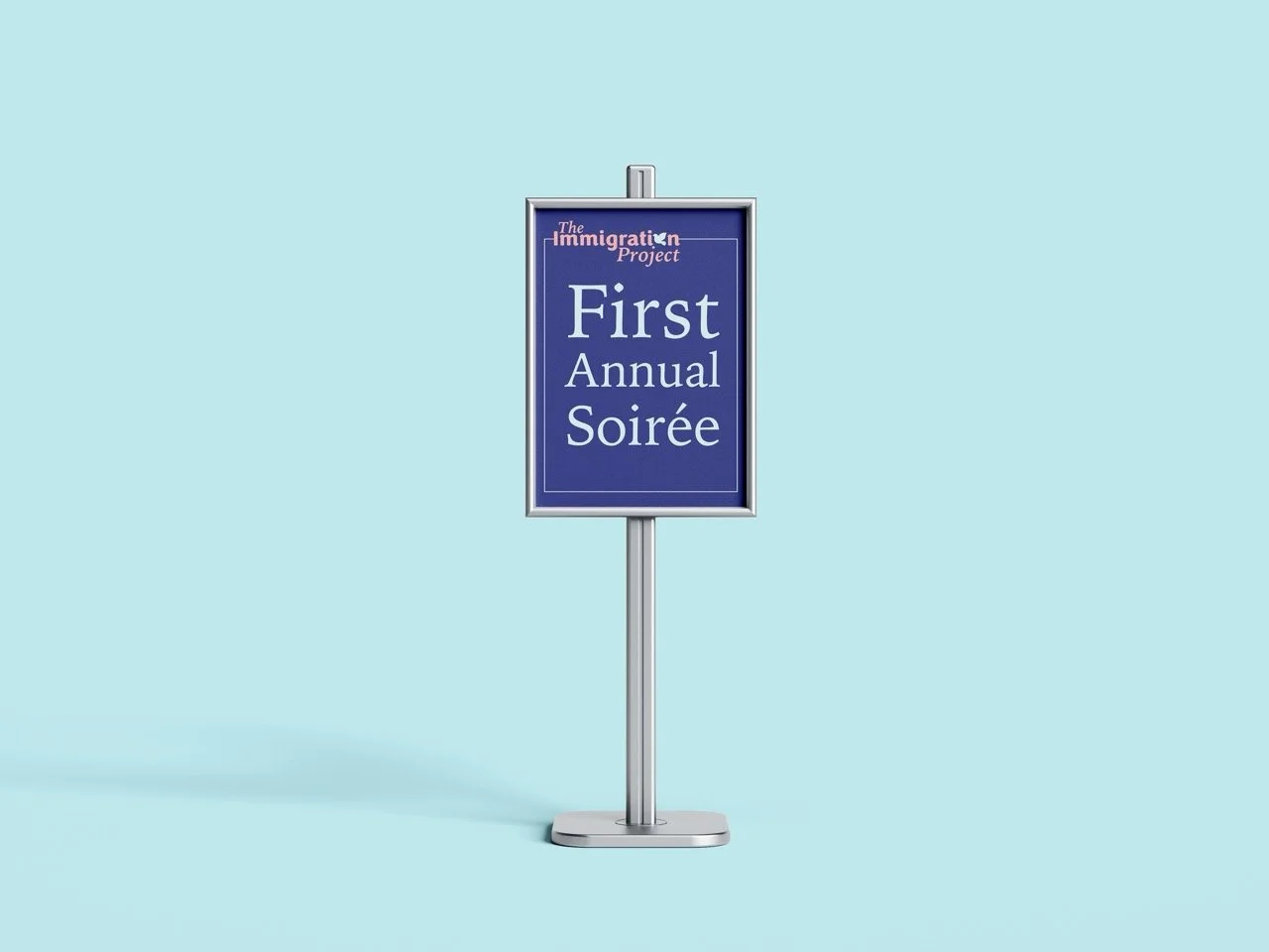
THE IMMIGRATION PROJECT
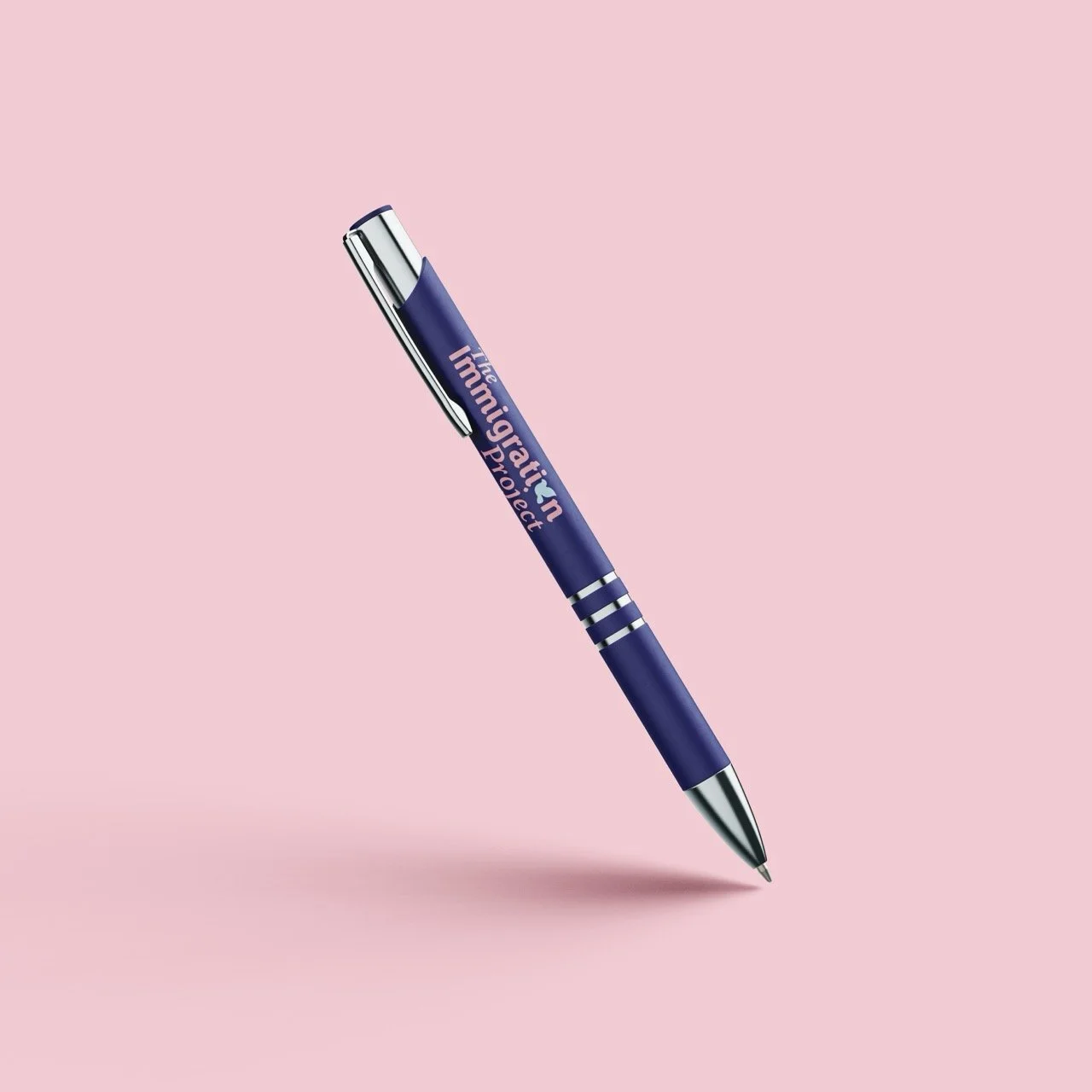
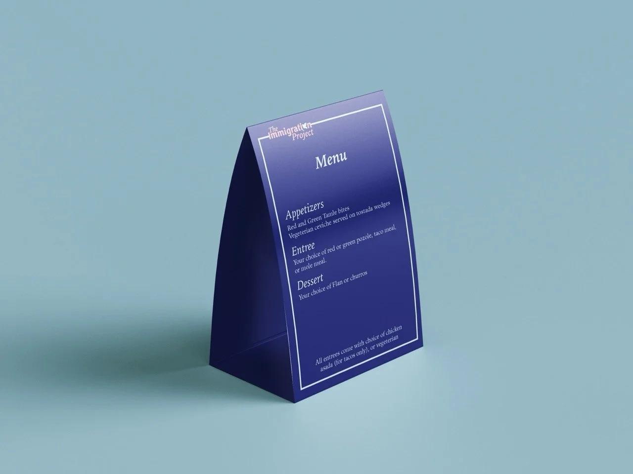
The immigration is a program that provides legal services to immigrants of central and southern Illinois. They provide attorney consultations, citizenship consultations, and more. The problem with the immigration project's visual identity was that their logo was too formal and not friendly enough. Since this is an organization that helps people their logo had to be inviting while also keeping some of its formal aspects. Designing The Immigration Project allowed me to experiment with communicating opposing ideas in a simple manner.


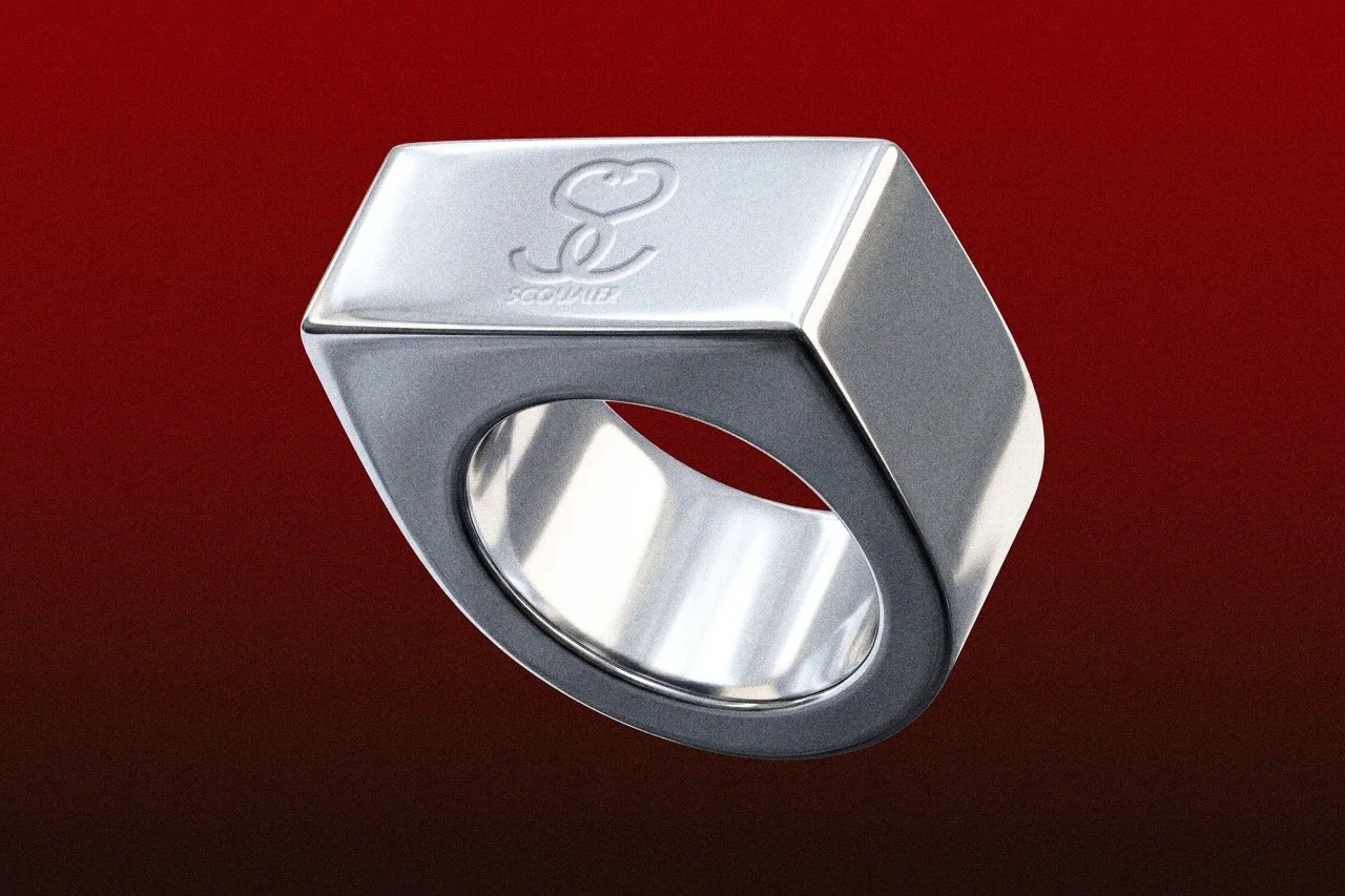
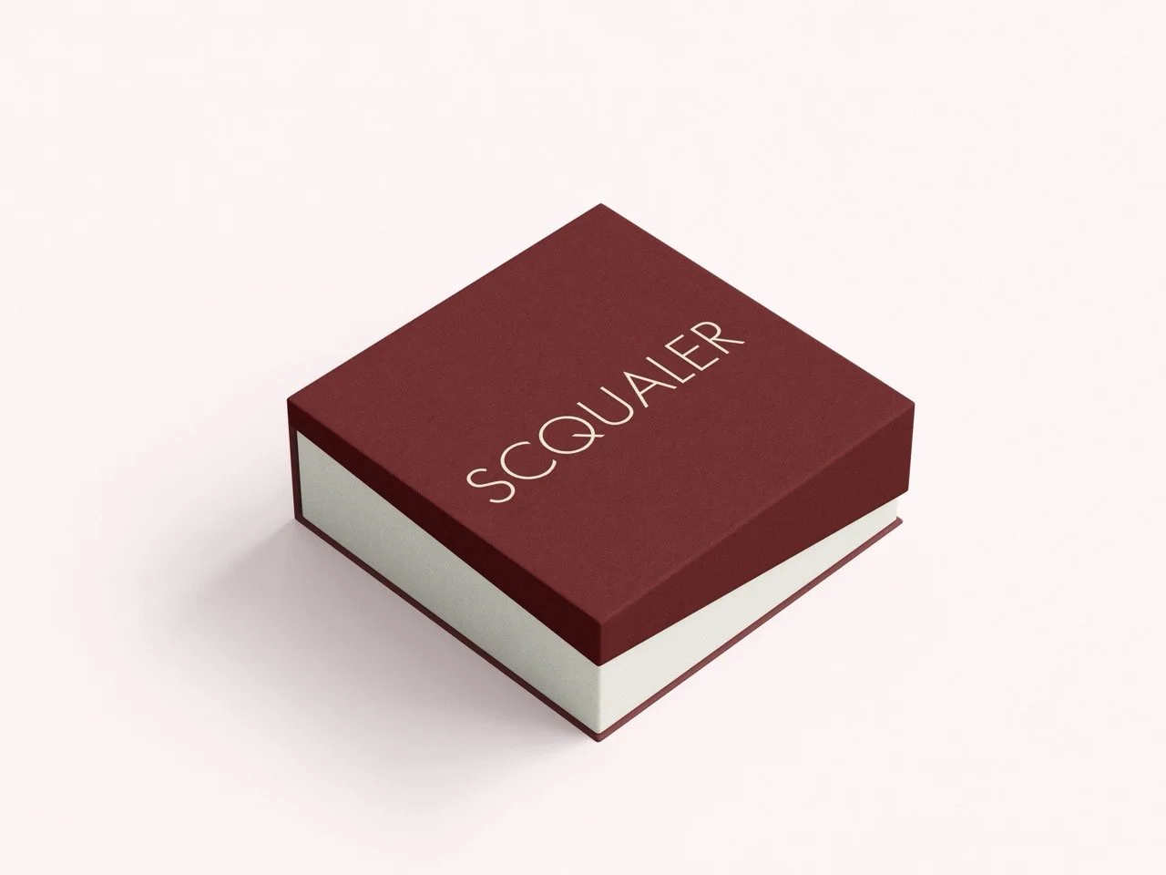
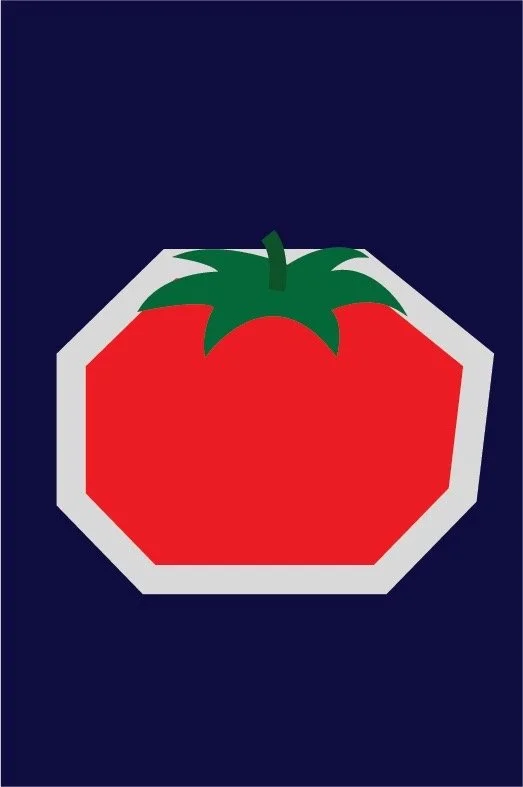
SQUALER
Squaler is a high end affordable jewelry brand, recognized for its variability of being able to look and feel like high end jewelry while remaining affordable. Derived from the brands values the branding looks like high end jewelry while also being simple and affordable to produce to maintain the brand's affordability within its products.


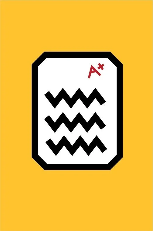
SPUDY
Finding off campus spaces to study, finding study playlist, keeping digital notebooks, finding studying techniques. These are issues that students come face to face with in their daily lives. The goal is to create a website to resolve all of these issues in order to improve students' academic goals.Having all of these resources in one spot is vital for students to actually concentrate on studying instead of concentrating on preparing to study. Spudy is a trusted source of wisdom and knowledge who leads with depth, clarity, and truth—yet sprinkles in just enough wit and lightness to make learning approachable and memorable.

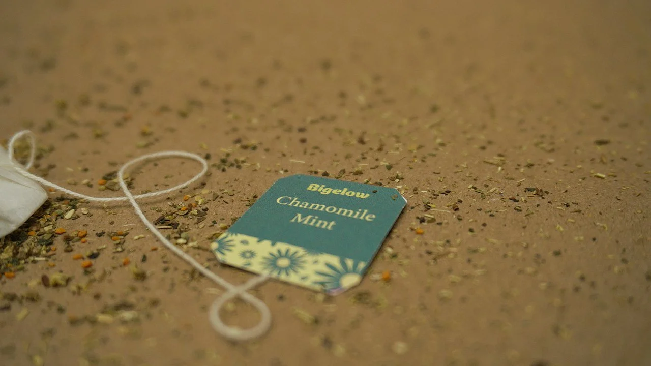
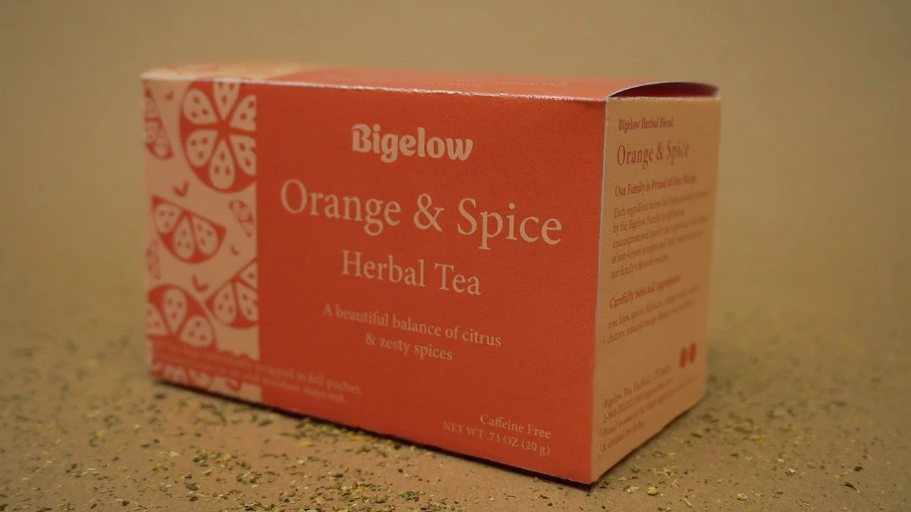
BIGELOW
This project is to redesign and rebrand Biglow tea to appeal to a wider audience while keeping a concise and uniform design aesthetic. Currently the brand's packaging has a wide variety of nonuniform designs which might confuse the customer looking to buy Bigelow tea. With this redesign we will make Bigelow tea be easily recognizable. Currently probiotic sodas like Poppi and Olipop are immensely popular. Both of these have a very bright, and colorful, branding. Is there any way that we could make branding like that but for tea? WE CAN! I decided to experiment with bringing that same style to the tea aisle. I used colorful colors that also communicated the tea's flavor and used very simple images to enforce that.


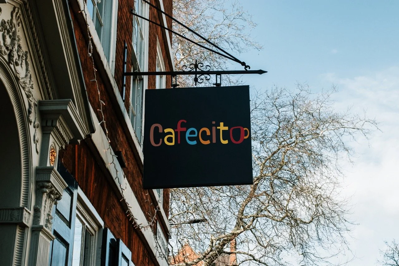
CAFECITO
While redesigning cafecitos logo I wanted to bring the essence of the Cuban culture. I did this by bringing in a fun colorful font. The font itself has some letters that are bigger than others, referencing the architecture of some Cuban neighborhoods. Translated cafecito means little coffee, I wanted to use that and reference cafe cubanos in the logo. For this I made a little cafe cubano for the last "o".


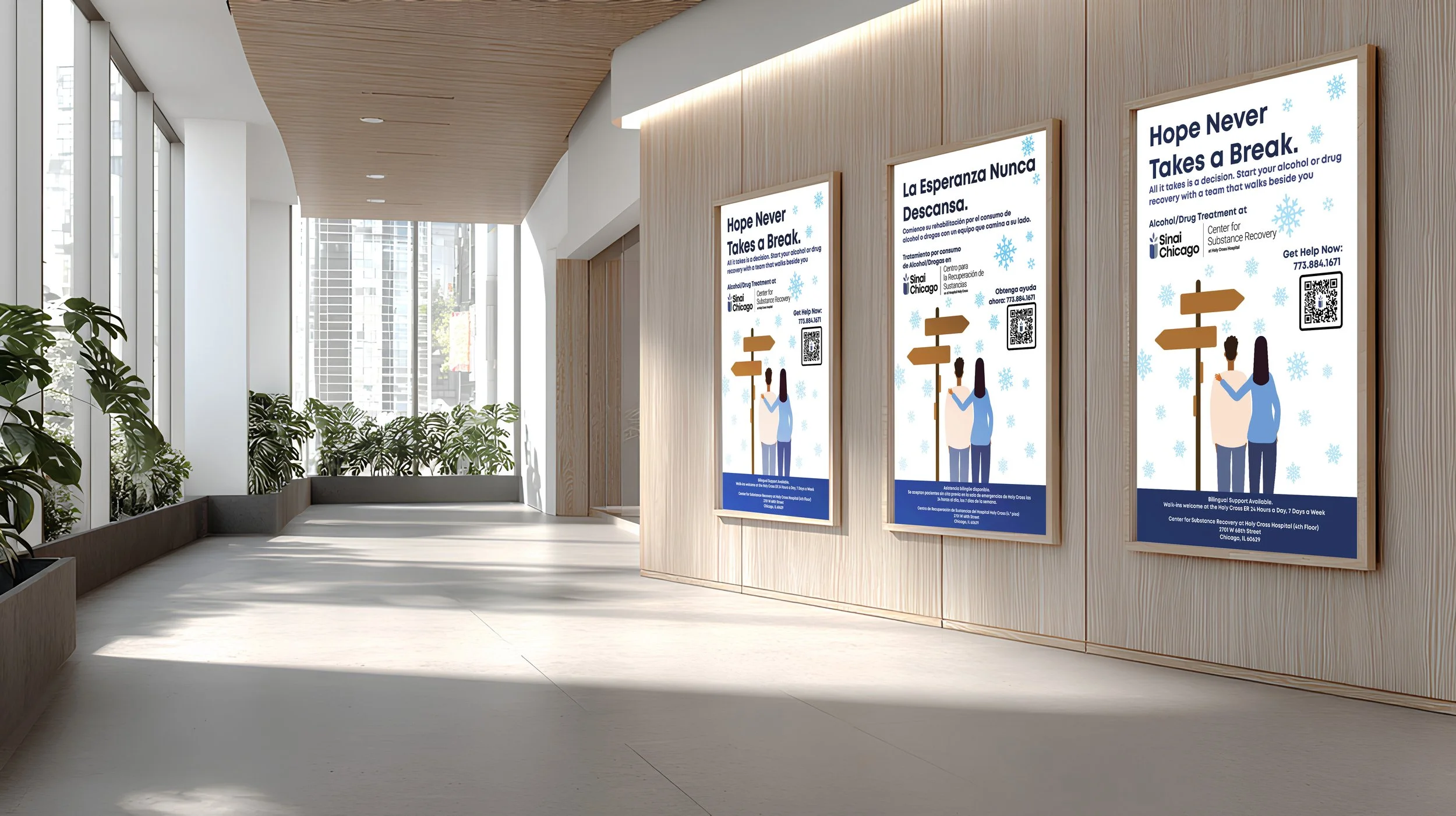
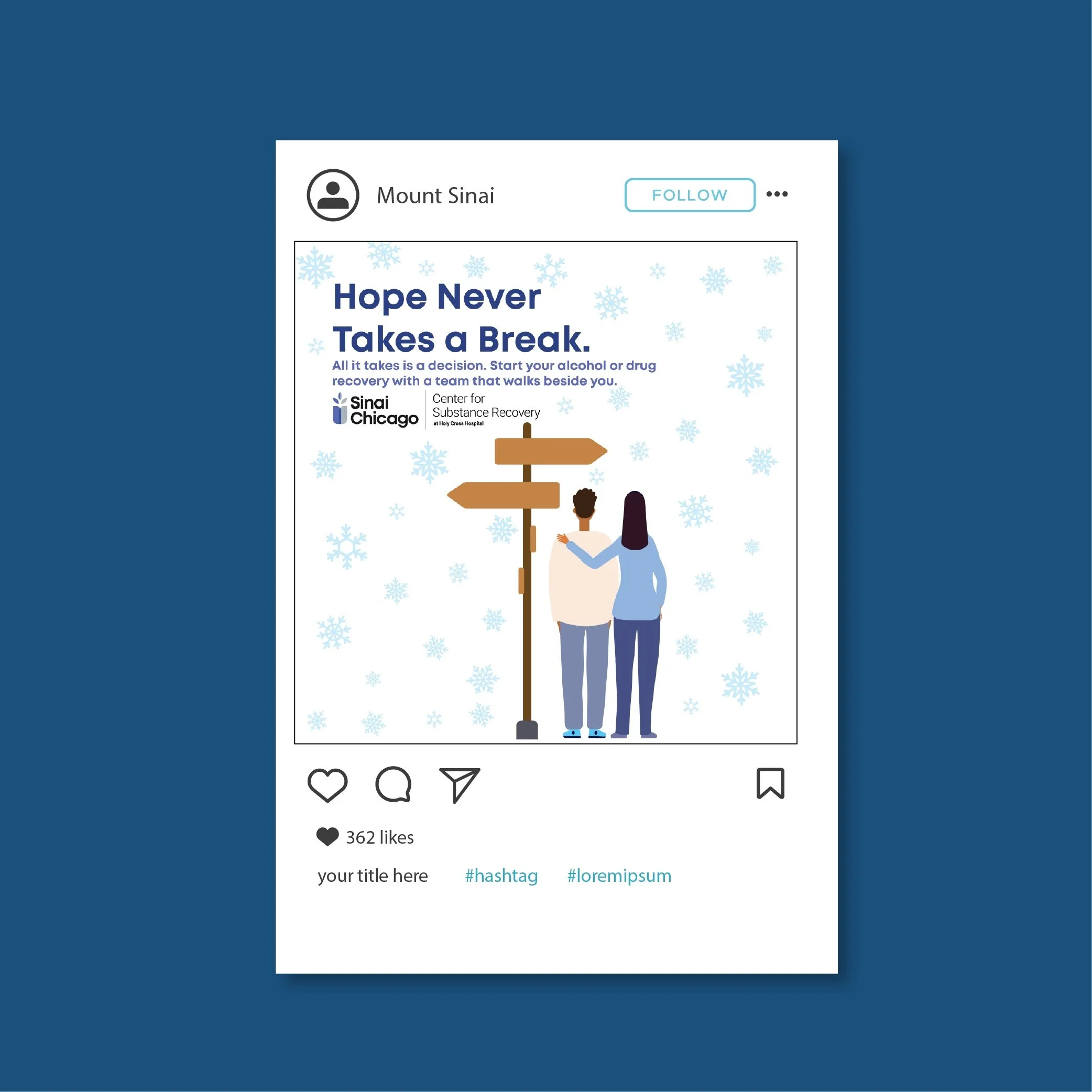
SINAI
The Marketing team at Mount Sinai wanted to create a marketing campaign that was different from the rest of their advertising. Their advertising consisted of using a mix of type and photography. How could they produce a professional and effective campaign for their center of substance recovery without using photography. By using animated illustrations I was able to demonstrate compassion within one another without the need of photography. I was also able to keep the branding and collaborative message that Sinai required.