LORRAINE CASTANEDA
Lorraine Castaneda is a versatile graphic designer whose work blends structure with creativity, strategy, and storytelling. Her process includes exploring different styles and concepts to produce strong and meaningful visuals. She aims to connect with diverse audiences with her impactful and memorable work. Through thoughtful design choices and refinement, Lorraine continues to grow more with every project and her portfolio reflects who she has become as a graphic designer.
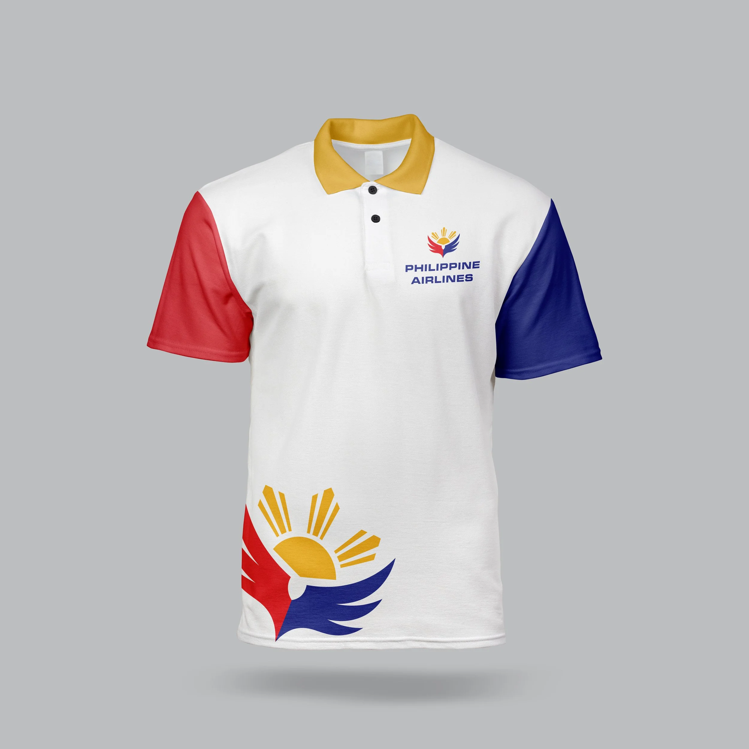
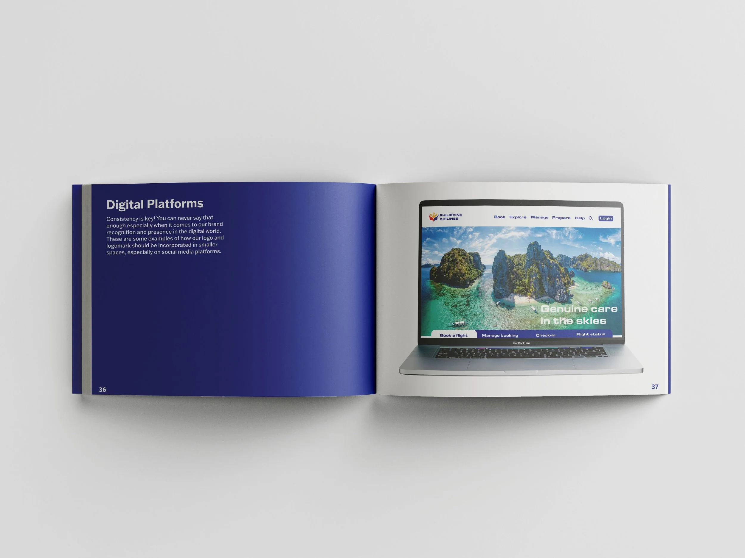
PHILIPPINE AIRLINES
This is a Philippine Airlines (PAL) rebrand that focuses on improving and modernizing the imagery of PAL’s brand while staying true to their brand personality: hospitable, sincere, and adaptable. This new logo aims for the brand to shine with confidence in the sky and let travelers know, this is truly the airline they should fly with.


CERVA BEAUTY
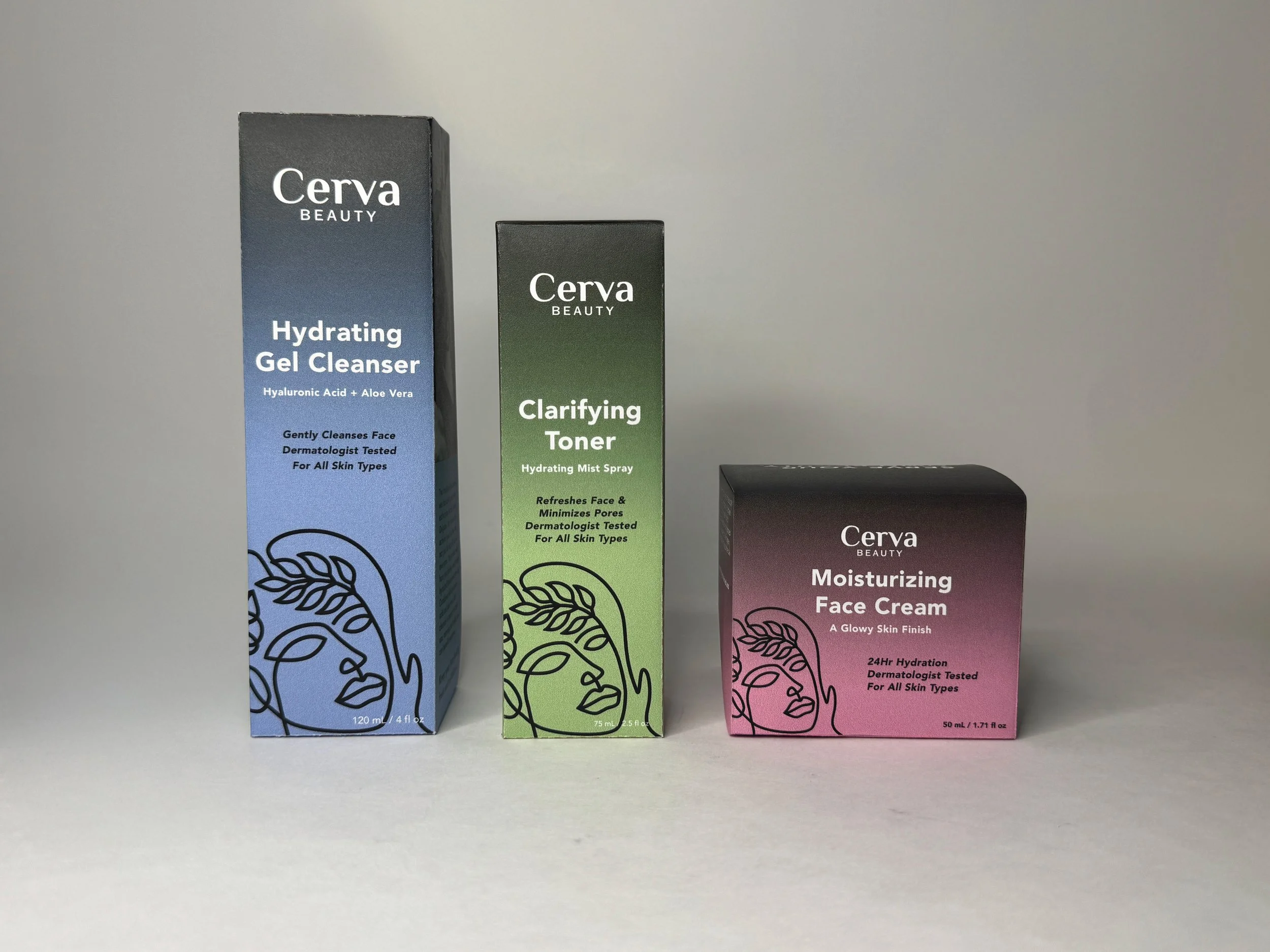
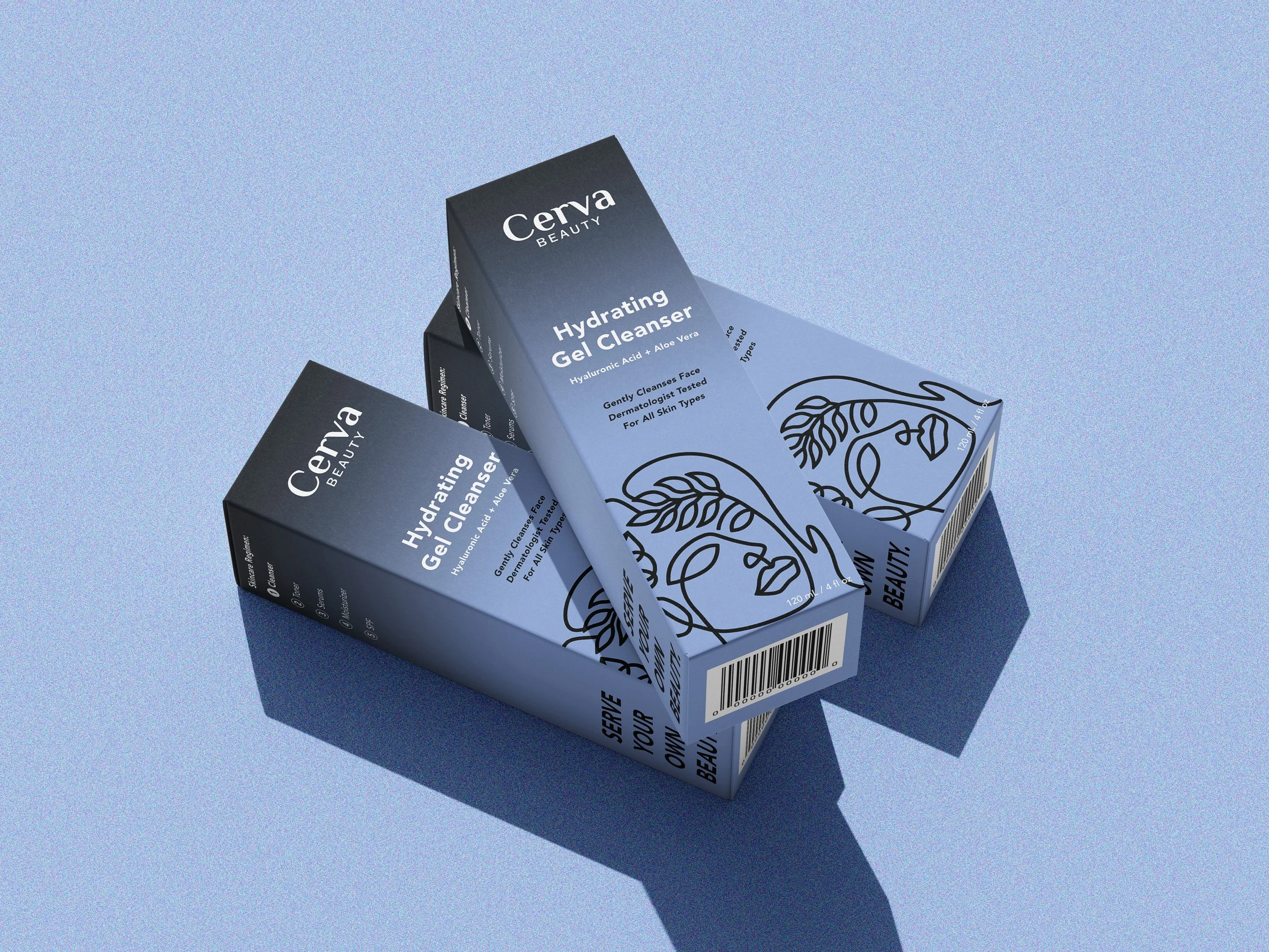
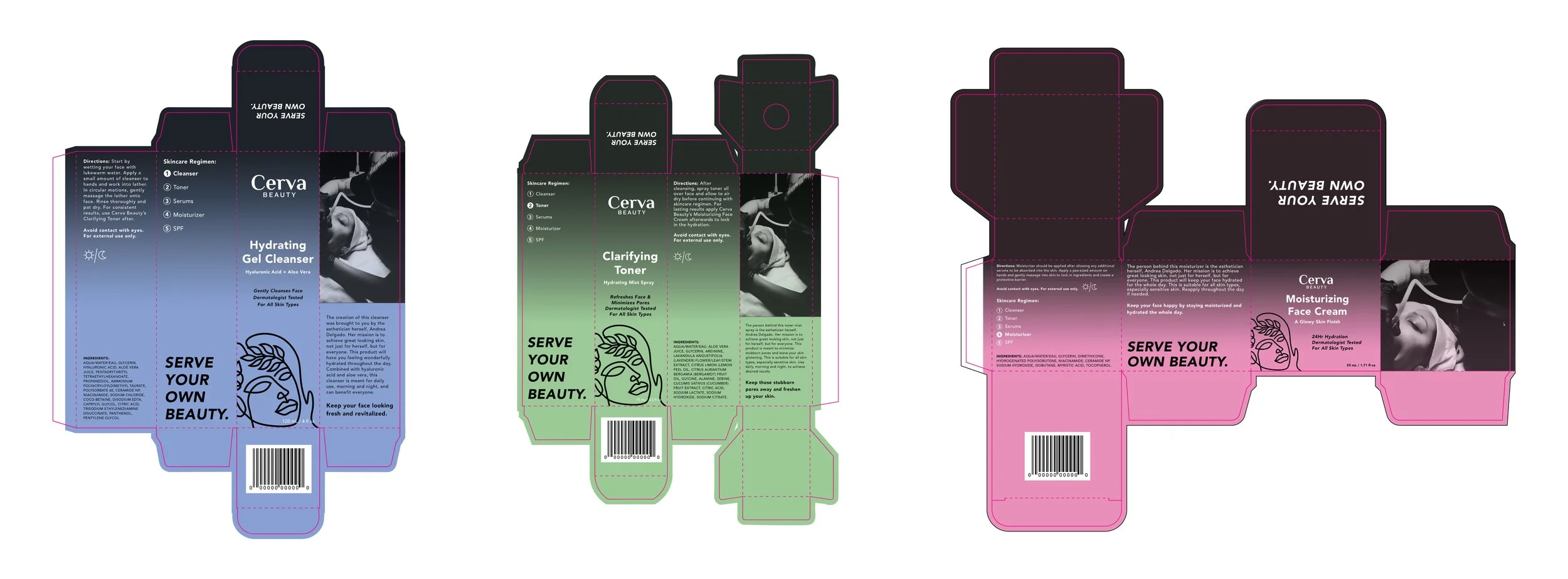
Cerva Beauty is a Latina-owned skincare brand and esthetician business that enhances people’s confidence in their natural skin. The brand aims for a modern and minimalistic aesthetic. The first line of products and packaging designs made includes a facial cleanser, toner, and face cream.


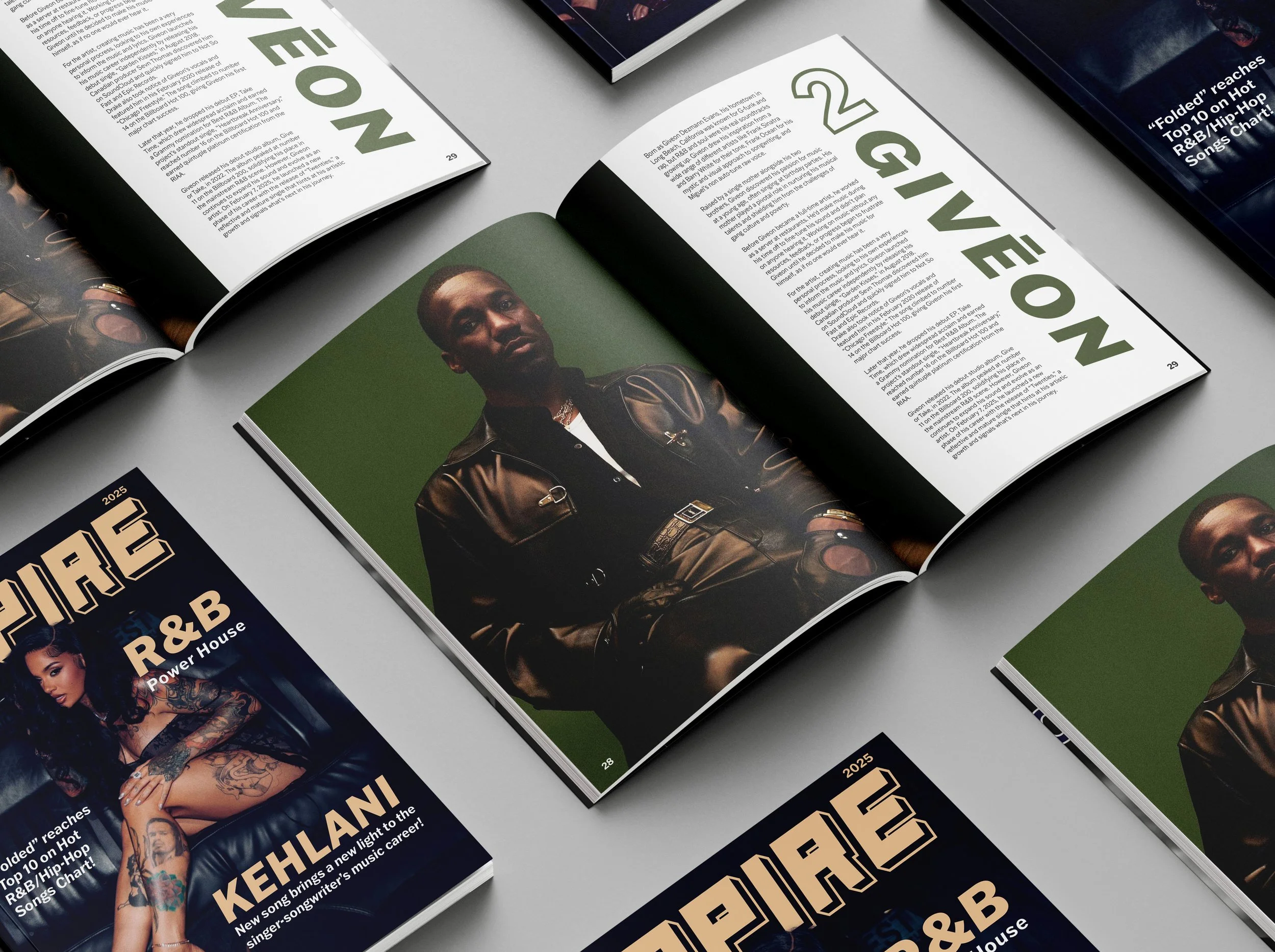
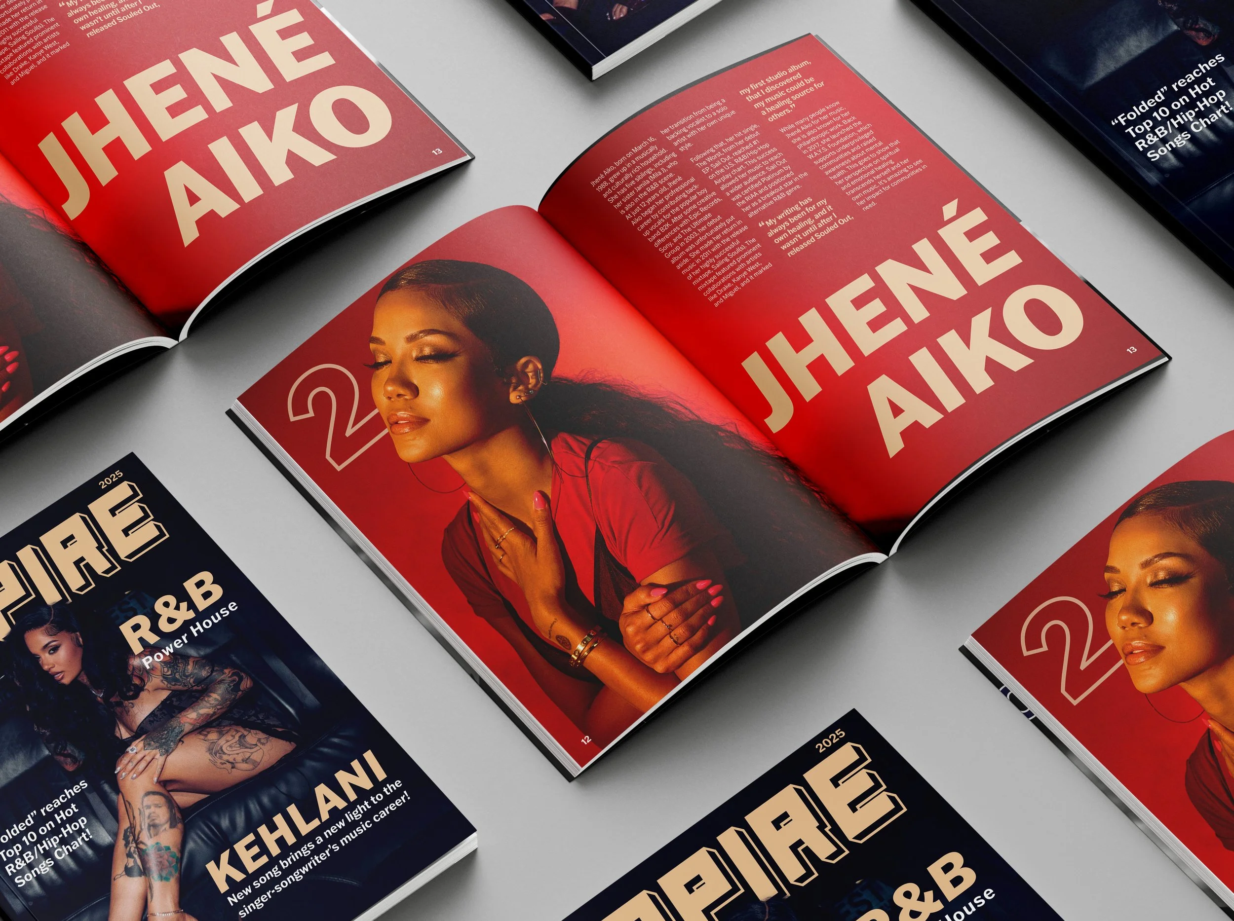
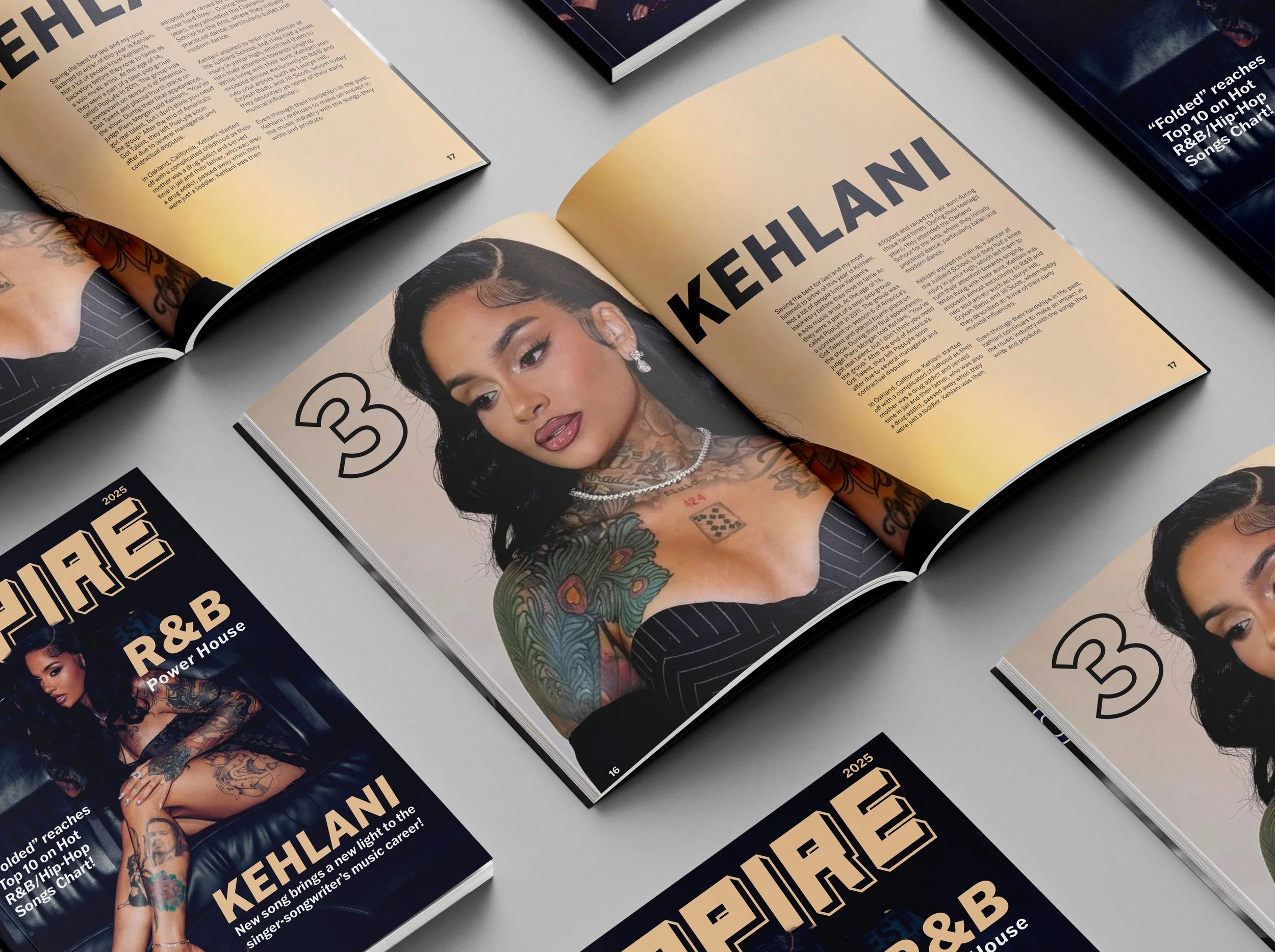
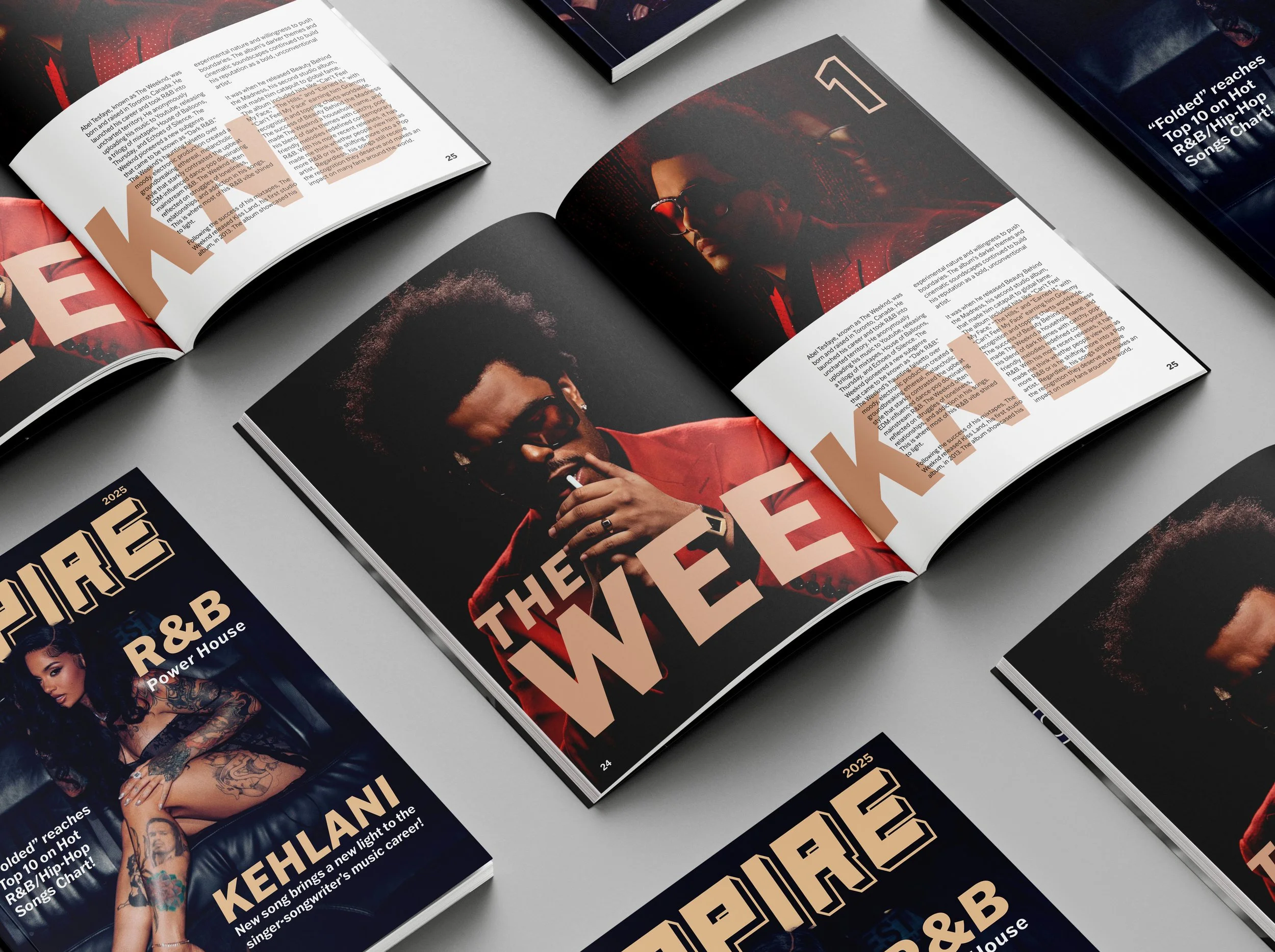
EMPIRE MAGAZINE
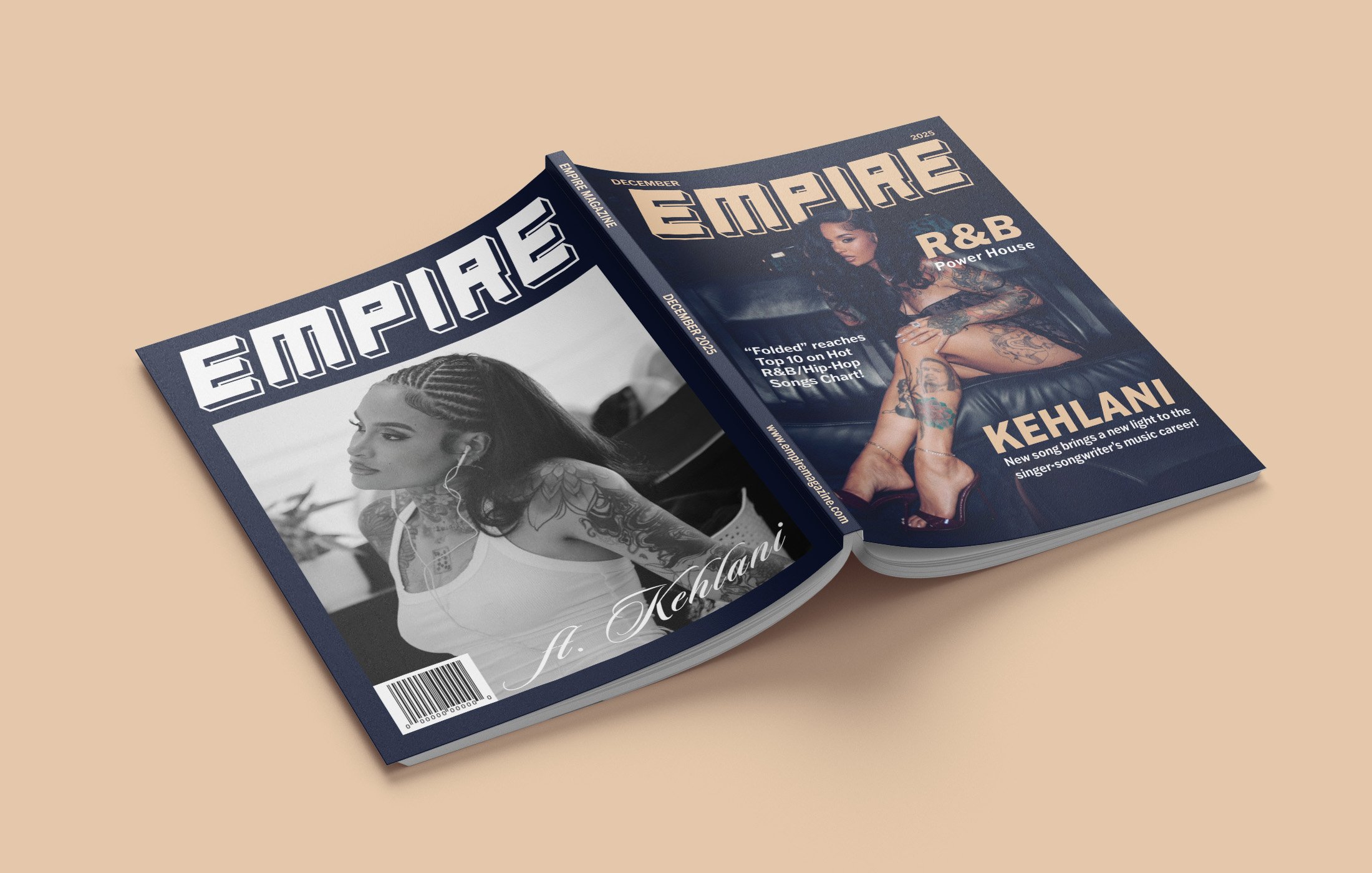
Empire Magazine is an R&B focused publication that features music artists that have made an impact in the genre. The first half of the magazine dives into 3 female R&B artists (SZA, Jhené Aiko, and Kehlani) while the last half are 3 male R&B artists (The Weeknd, Givēon, and Chris Brown). Each spread talks about their background and the accomplishments they have gained throughout the years.
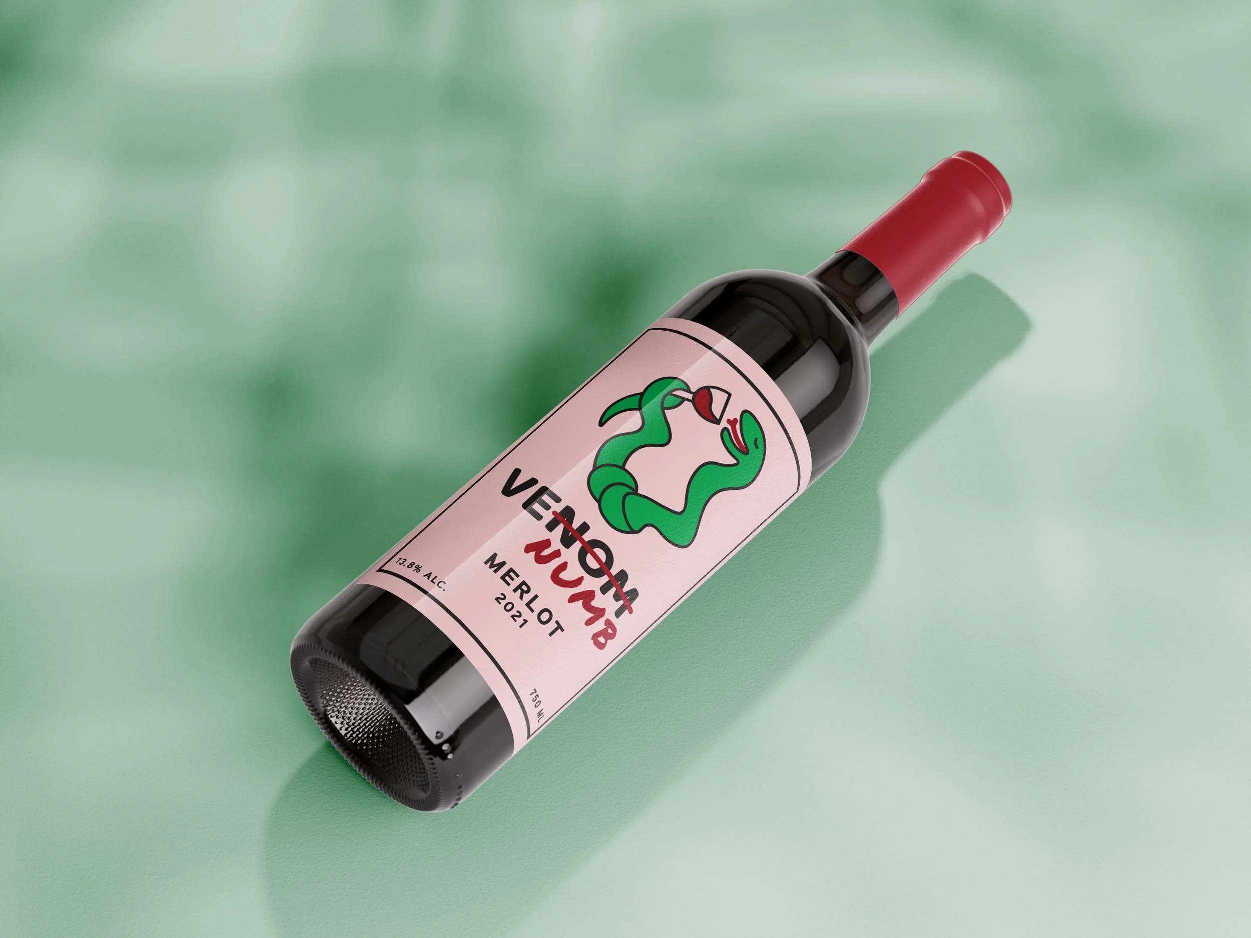
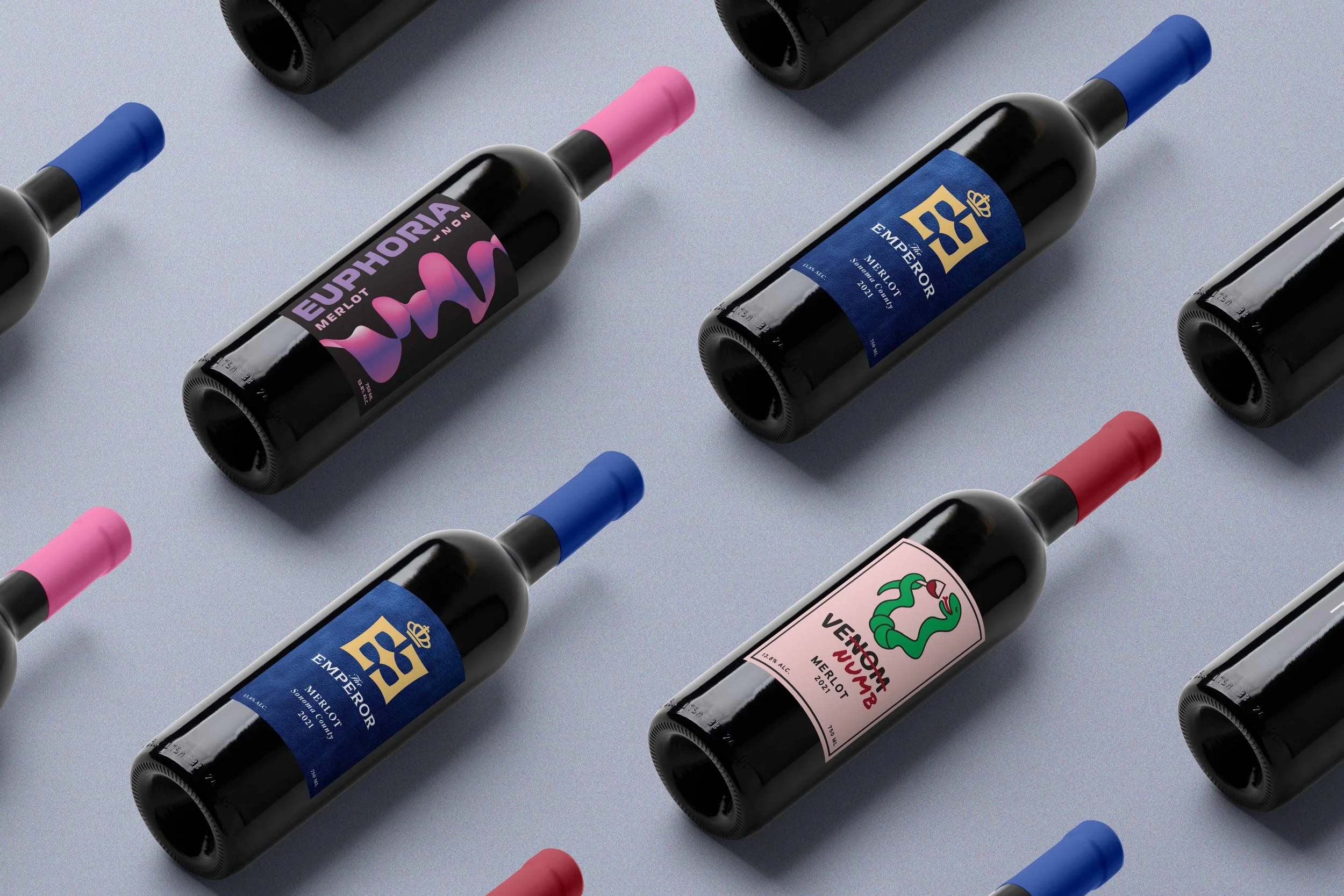
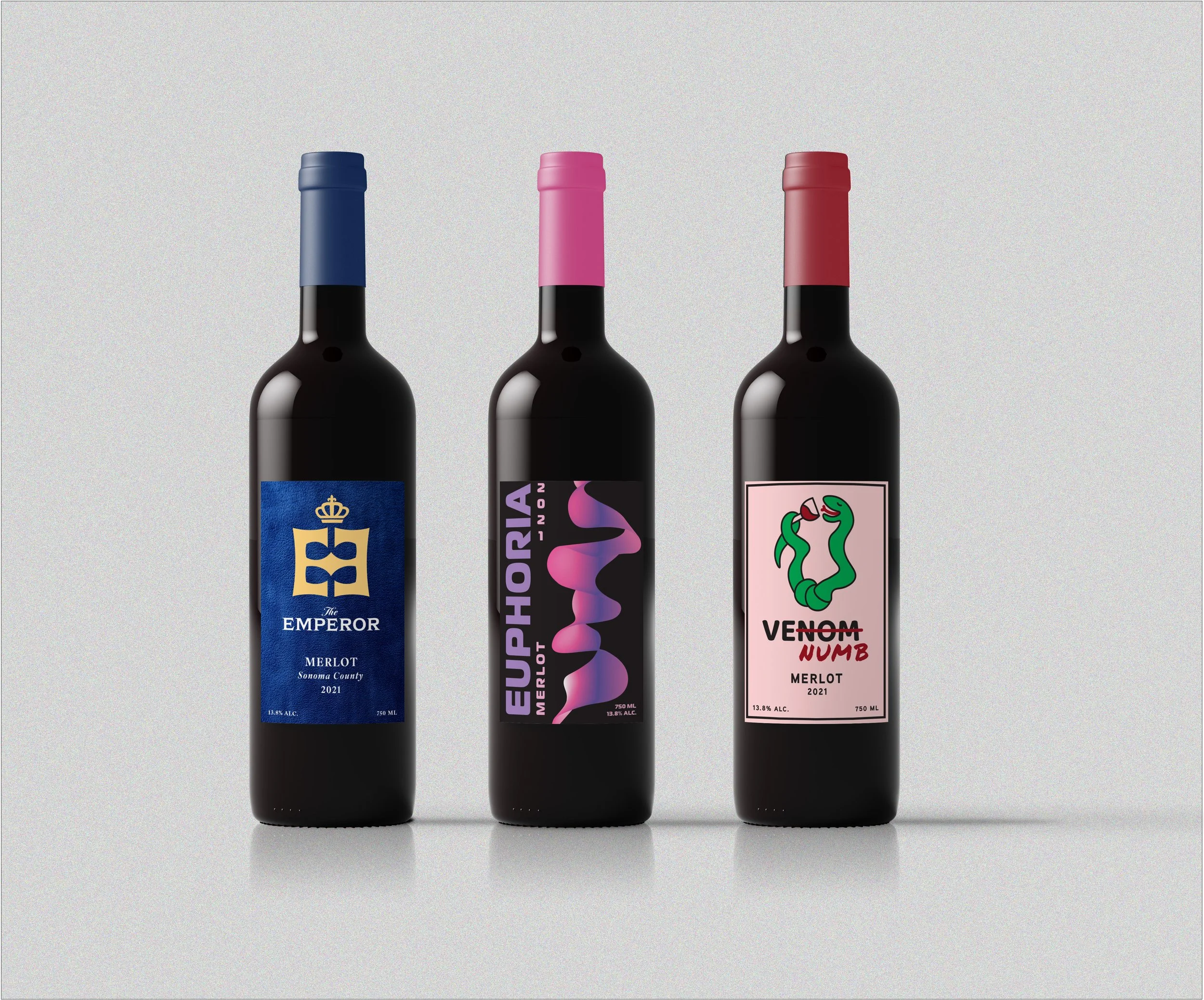
CASTANEDA WINERY
These three distinct wine labels are self made for the Castaneda Winery to reflect three different levels of wine: classy, contemporary, and casual. The Emperor (classy) speaks with elegance and tradition, which is fit for formal and special settings while EUPHORIA (contemporary), brings forth a sleek, modern look that appeals to today’s trend-focused audience. VENUMB (casual) on the other hand, keeps things relaxed, more approachable, and fun for people who want to add to their wine collection.


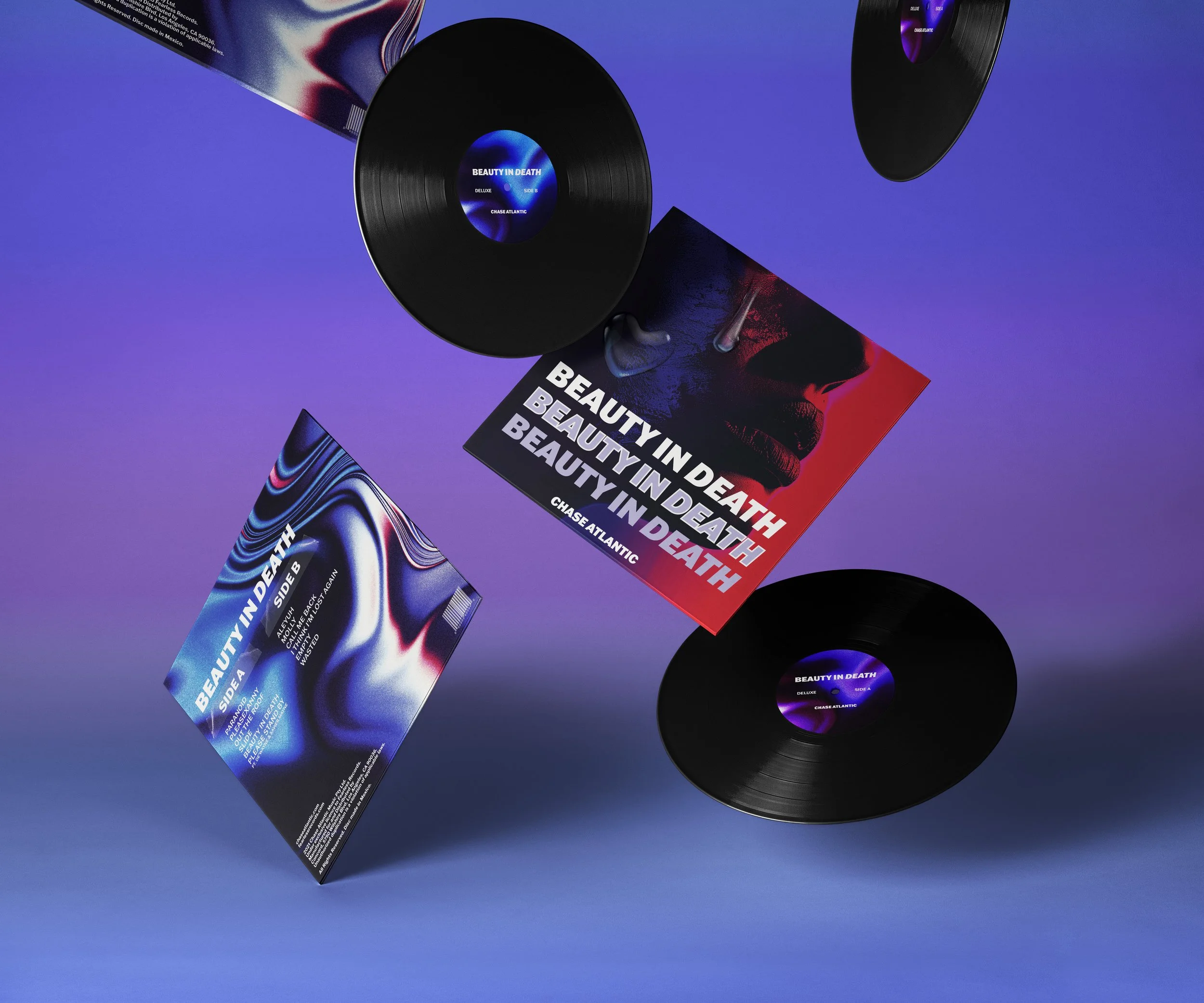
BEAUTY IN DEATH
This is a redesign of Chase Atlantic’s album called “Beauty in Death.” The aesthetic for the front and back cover of this vinyl are inspired by the color combination (red and blue) of their regular and deluxe album. The main highlight of this design is a zoomed in image of a mysterious female face that primarily leans in with a song in the album named “Molly.”